Last updated on July 23, 2025

Forest (Unhinged) | Illustration by John Avon
John Avon is one of the mostly highly regarded Magic artists, so much so that I would bet that if a newish player only knows the name of one Magic card artist, it’s Avon’s. What makes his art, so often lands, sing to the fans?
We’re going to discuss his best pieces of work here, and I know you‘ll find something to argue about if you’re already into Magic art. If you aren’t, then you’ll experience something wonderful.
(Editorial Note: This article was already commissioned before we heard that John Avon is taking a partial retirement from painting and attending events to focus on his health. We wish him all the best, and hope to see him again soon in whatever capacity his health allows. You can read John’s announcement on his Facebook page here.)
How Many Cards Has John Avon Illustrated for MTG?
Ancestral Vision | Illustration by John Avon
341 cards. That makes him the sixth most prolific MTG artist. 184 of those cards are lands, making him the most prolific artist of lands in addition to being the most well-known. You can see Avon’s entire MTG catalog here. Avon is being closely trailed by Adam Paquette with 170, so stay tuned.
What Is John Avon’s Art Style in MTG?
Avon is almost synonymous with MTG lands. Even his nonland cards often have a lands focus, and not just winks to his lands oriented oeuvre with compositions like his Iconic Masters Ancestral Vision. Sometimes it’s a landform style scale like his Angelic Wall from Odyssey, his iconic original Explore from Worldwake, or largely forgotten cards like Mirror Sheen. He also throws down clear nods to his typical lands iconographies like his close set tall trees, as in Dawntreader Elk, or his 7th edition Millstone, which he set rolling down a very John Avon mountain.
Most of his Magic art has been made with the technique he picked up in the 90s, replacing his previous use of oils with acrylic painting supplemented with an airbrush. In the past 10 years he has increasingly moved into digital work, seeming to have progressed beyond sketching and then scanning to some actual use of modeling software.
Avon has a classical Renaissance-ish eye for light and shape, but a more dramatic and baroque use of perspective and angle in the frame (think of David Lynch as John Ford in The Fabelmans). Avon’s paintings have the realism you’d expect given those interests, but I’d argue that the signature John Avon effect comes from the meeting of that detail with the airbrush, which means we get lots of mist and fog effects as well as soft blocks of glowing color, or both.
You can compare this to Paquette’s prolific body of land work, where mists and soft blends are used sparingly, even in places where you’d expect them like a waterfall. When they appear, they tend to soften the edges of everything, which is a clear contrast with Avon.
All that said, it’s time to rank the top pieces of John Avon’s MTG art. I realize the insanity of this task. It’s all so good, how do we choose? If I’m ranking every Mountain art in the history of the game by all artists, I have a clear way to separate the styles of a dreamy Avon, a meticulous Paquette, an original Douglas Shuler peak, the more pen and ink style of Tom Wänerstrand, or something very different like the stained glass Magali. It would still be hard to choose, but I’d have some handholds to help me get a grip.
With Avon, you have to join me in the mists and shadows of my perspective, which I suppose fits nicely with the work overall. At the very least, this should be a lovely showcase of the work of someone who, more than any other Magic artist, contributed to that feeling that Magic was something special. Something that opened a window into another, beautiful world.
Honorable Mention?: City of Ass

City of Ass | Illustration by John Avon
City of Ass feels like a brief you wanna send out to Kaja and Phil Foglio just as they were leaving the MTG game to start their Girl Genius comic series. Yet somehow this ends up on John Avon’s desk. His cheeky approach to the subject really sells the joke, especially the subtle airbrushing of the asses in the back. Like, this card is still really dumb, but in Avon’s hands I can see this as a destination in your weekly off-serious D&D campaign.
#19. Witching Well
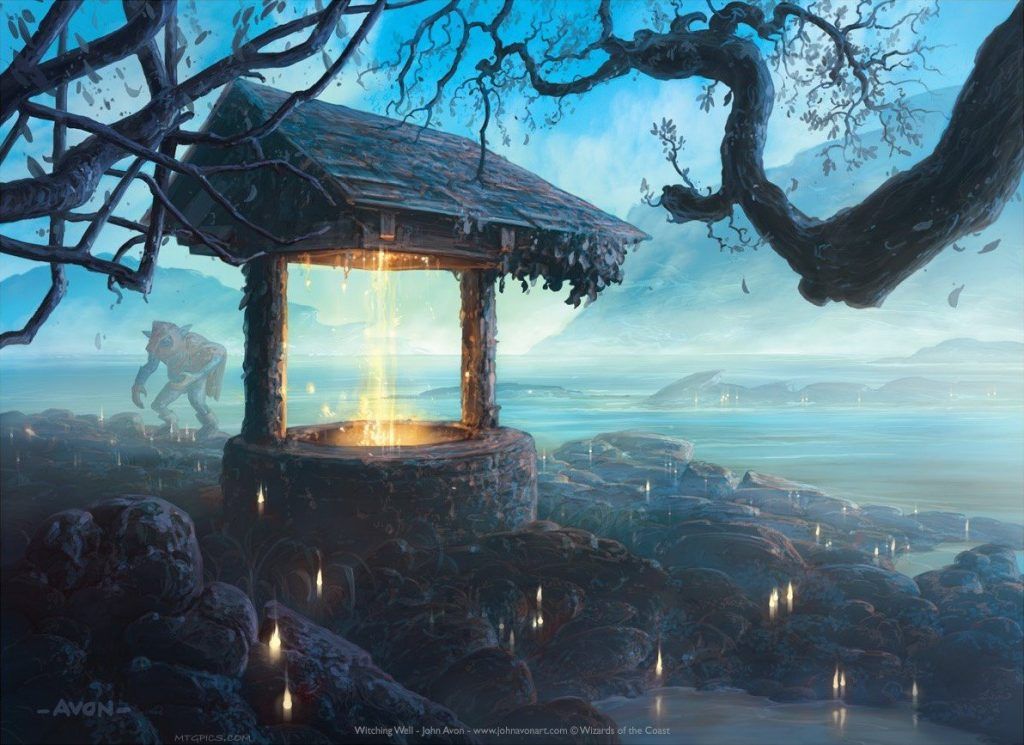
Witching Well | Illustration by John Avon
As neat use of the three planes—foreground,, midground, and background—as you’ll see often with Avon's work! The Witching Well itself, in the front, is inviting yet ominous. The monster stalking about the middle ground pops out later as you look at the art, which is on point. And that classic misty Avon background is there, beautiful as ever. The flowing spots of light (wishes, presumably) that spread from the well are the icing on the cake. A nimble and fascinating piece of work.
#18. Rakdos Carnarium

Rakdos Carnarium | Illustration by John Avon
Only John Avon would approach a scene with hanging viscera in a circus tent in this specific way. Unlike the shiny, brutal world of most Rakdos cards, Avon gives us a Rakdos Carnarium that looks shabby, empty, and sad, almost anticipating the weird vibes of Art the Clown in Terrifier. It’s no less scary for being empty, as the light from outside of the tent that reminds of a better world outside shines so brightly as to obscure the tent edges. Who knows what lurks in those shadows? And the circular composition visually pulls us forward to trap us in the circle, but we are still on the edges, maybe the opening flap of the tent; if we hurry, we can turn around and skedaddle before someone sees us.
#17. Commander 2013 Raven Familiar

Raven Familiar | Illustration by John Avon
A similar trick with the appearance of depth happens in Avon’s Commander 2013 reprint of Raven Familiar. The almost fisheye foregrounding of the raven, who looks expectantly at us, serves to emphasize the mostly occluded expanse of workshop behind it, inviting us to investigate, goaded by the eyes of this raven, who’s more of an alwaysyes to casting some spells, not a nevermore.
The genius of this card is the teal blue glow that highlights the feathers of its back, shining in the mirror over the mantel, and glinting off the walls. We need to go inside to get around the bird and see what it is. And a peek can't hurt, right?
#16. Portal Starlight

Starlight | Illustration by John Avon
No hate for Brian Despain’s 7th Edition update on Starlight, but Avon’s original is surpassingly lovely. It’s a shame the card is now largely unplayable, and I would vote to repurpose this art, last seen in 1997, as a new take on an Arctic Flats sort of land. Who’s with me?
The stark black of the trees in front of some, for Avon, restrained airbrushing just at the last moment of dying twilight, creates an atmosphere that reminds me of Shin Hanga era landscape prints, specifically Hasui Kawase. Perhaps all the copies have faded or the WOTC transfer made adjustments, because Avon sells prints of this piece that I like a lot less that give off vague The Color Out of Space vibes.
#15. Waterveil Cavern

Waterveil Cavern | Illustration by John Avon
One more for the list of arts I want to see again on an unreprintable card, Waterveil Cavern. The lurching shadows at the side of the frame are difficult to grok at first, until you see the flying thing at the upper left, highlighted by the glow. You can pick out how it casts a shadow on the illuminated plume of mists, perhaps the only time we see that in Magic art, and it leads us to conclude that the shadows are themselves suspended on the mist, meaning that we are in the tableau, surrounded by arcs that feel like the rounded aperture behind the veil of water.
#14. Onslaught Forest #347

Forest (Onslaught) | Illustration by John Avon
Both of Avon’s Onslaught Forests are good, but this one is in another league. This is Avon working with the card frame beautifully. The black shadowed foliage in the foreground echoes the black border, and the color connection to the text box really gives you a sense of iterative design, which increases the feeling that you are moving into the lush tunnel of space through this jungle, almost as if we are getting a whiff of the classic dolly zoom technique from The Lord of the Rings.
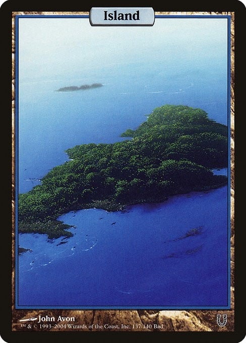
#13. Invasion Island #336

Island (Invasion) | Illustration by John Avon
As much as I love John Avon, the Island, when not full frame, is not his strongest subject. Perhaps it’s his love of foreground shapes, which he solves here with the hooked poles and the darkened wreckage/seaweed/beached creatures in this inverted view from the island itself. I love the commitment here to the same register of blue in the sky and the water, which can be an oppressive sameness usually avoided in the color schemes of Island artists, who tend toward teal/green versus sapphire/lapis or Payne’s grey versus ultramarine.
Avon differentiates the zones with degrees of airbrushed haze in the waters and sky, mirroring his usual trick of hazing out forms as they vanish into the distance. And that hazy arc up to the right from the center of the water, a current of wind through wisps of mist or perhaps another shadowy landform, creates a tunnel effect with the columnular landform on the left, giving us just the touch of a vortex, a hint of disquiet as we contemplate our potentially temporary survival on this beach.
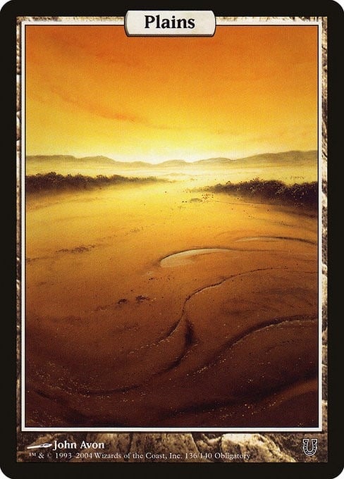
#12. Invasion Plains

Plains (Invasion) | Illustration by John Avon
John Avon isn’t the only MTG artist who likes to design a Plains piece around a rising or setting sun, but he may be the best. He loves a blinding sun that glints across the landscape with his airbrush technique. My favorites of his in this subgenre are sunrise plains that span his later career.
The first is his Invasion Plains from 2000, where the light tricks you into thinking it’s painful to look at. It glints off the seedheads of the grass, an effect that starts beautiful but feels menacing the more you look. Someone or something has pushed through these grasses before you, leaving the immediate clearing. Will you see them soon enough in these conditions if they're hostile?
#11. 2010 Plains

Plains (Magic 2010) | Illustration by John Avon
Ten years later, for Magic 2010, he executes a similar field of grain, but with a golden optimism. The light is softer, more yellowed on the golden Plains, illuminating your path instead of obscuring it, a godly eye shining where the mountain meets the clouds. It’s a neat trick, the colors of Golden Hour and sunset set in a clear yellow morning sun, a perfect encapsulation of the big rules changes ushered in in that set: a beginning that feels like an ending, an ending with the hope of a beginning.
#10. Dragonstorm Plains

Plains (Tarkir: Dragonstorm) | Illustration by John Avon
Our most recent card on the list, his Tarkir: Dragonstorm Plains leans even further into the sunset/sunrise space, but with a crackling upward energy the previous sunrise Plains lacked. The clouds curl into a vortex rising from the sun, mirrored by the landscape, with shadowy outcroppings that are probably rock, but might be the buried scales of long-hidden dragons. The path is clear, if darkened, close to us, as it winds past the grasses we stand in, but the distance is uncertain. That distance is filled with energy and movement and light unlike anything Avon has shown us before.
I’m tempted to think about this as a reflection on Magic itself as it ages past 30 years into an unknown future filled with Universes Beyond. I’m also tempted by biography, as Avon approaches his 65th year. The future is unknown and different than what was before, but this piece feels like Avon telling us it’s going to be alright.
#9. Adarkar Wastes

Adarkar Wastes | Illustration by John Avon
Avon’s 7th edition Adarkar Wastes was a revelation after the animation styles of Mike Raabe’s original and Gary Leach’s 5th Edition versions. The feeling of the expansive wastes really comes through. The line of diminishing trees through the off center focus gives a feeling of being pulled into this forbidding stretch of emptiness, for my money the most effectively executed rendering of still water in all of MTG art. Shadowing the landforms helps us focus on the steely waters and the play of the dying sun’s reflection.
It suffers a bit given the assertive black line business of the then new 8th Edition frames, and the fact that Avon seems to adapt his style to the reality of those frames as time goes on is another testament to his mastery of the form.
#8. Invasion Forest #347

Forest (Invasion) | Illustration by John Avon
Here’s a good clear example of how Avon adapted to the assertive visuals of the 8th Edition frame, creating almost black trees in the shadowy grove. The green glow on the 9th Edition Forest isn’t exactly the same color as the green background of the text boxes, but it’s close enough to pull your gaze upward to the frame, which then visually signals the big text box, which gives the whole thing some of the feel of a full art land without actually being that.
#7. Lantern-Lit Graveyard

Lantern-Lit Graveyard | Illustration by John Avon
So many of Avon’s forest images use this trick of the sunlight beaming through the trees, including the classic image in our next card, but Lantern-Lit Graveyard feels like a creepy joke on that motif. Instead of actually being lit by the lanterns, which just suffuse a dim orange glow, the graveyard is illuminated by a glowing mist encroaching across the space. This ghostly light puts the foreground in deep shadow but isn’t robust enough to light the space much higher than the tombstones. So it all feels unnatural and creepily uncanny, but only if you take that second look at an image that doesn’t feel quite right.
#6. Dawntreader Elk

Dawntreader Elk | Illustration by John Avon
This is what you expect of the light filtering through the trees. The morning beams glazing the antlers of this still shadowy Dawntreader Elk, its shafts of light slicing across the thin trunks, is a bit breathtaking. You’ve startled the beast, and it pauses to size you up before it disappears into the waning shadows of the ebbing night. Do you loose an arrow, claiming the forest for your own, as befits the card’s text, or do you let it walk on, your tentative ally from the natural world when your opponent, once again, unleashes the fell creatures of the night in the lands of Innistrad?
#5. Orzhov Guildgate

Orzhov Guildgate | Illustration by John Avon
Not only do I like Avon’s first Gatecrash Orzhov Guildgate better than all others, including one more from Avon himself for Dragon’s Maze, I honestly think this is the best piece of Ravnica building art in the game. I set myself against the visual environment of Ravnica from the start, so different it was from the open sword and sorcery vistas of earlier Magic; I felt as strongly then as folks respond to Universes Beyond now. It felt like the utility of the hybrid mana cards that facilitated the mana in a guild set, a kind of rote industrial gothic megalopolis that served as a simple, but uninspiring backdrop for the real life and color of the set, the worldbuilding of the guilds. Brownish grey buildings, crowded and samey, like the secret 11th guild of the Ravnica HOA leached the color out of the exterior facades of the world, all looking vaguely flat and beaten down, pretrampled for the later invasion of the Phyrexians and then all those fedoras.
Except for this gate and a handful of other pieces from Ravnica that I like. Avon’s gate looms out of the, of course, misty shadows, the orderly, Frank Lloyd Wright-ish window patterns speaking to the white and the arched gothic gateway, somehow still in Rippery 1888 shadows speaking to the black. The gate oozes forward, asking you to enter, never promising not to extort you along the way.
#4. Urza’s Saga Mountains


The Mountain is Avon at his best, and I would posit the four he did for Urza’s Saga as almost the pinnacle of his art of summits. Each uses various ethereal red hazes to set off looming landforms, echoed by foreground masses. #346 feels like the least of these impressive peaks, especially when compared with the majestic view of #343, but both are still lovely. The real gifts are the other two, both of which use the foreground shapes to echo the background forms in the bright Cadmium Red register of the previous images. #345 is awesome, but #344 feels like apex. Perhaps that's why it got reprinted in the Planechase Anthology, with a bit of a spit and polish. 344 highlights the similarities and differences of the two focal planes, giving the viewer a sense of temporary pause to absorb the visual, which feels like my response if I rounded the closer form only to see the monstrous peak emerge from the mists in front of me.
#3. That Mirage Mountain

Mountain (Mirage) | Illustration by John Avon
The scarlet peak, Mirage #346. You know, the one you see someone roll out on Arena and you take a second with it, even in the small, digital version. It’s such a contrast to any other land in early Magic that it feels like an immediate artistic broadside. He did all four Mirage mountains. His first Magic piece, “Purple Mountain” is lovely, as are the similarly mist-shrouded peaks on his #343 and #344, the three of which, taken together, feel like a travelogue through the three regions of Jamuraa.
But the scarlet peak knocks your socks off. The deep black foreground, with the detailed foliage imparting distance and depth, the reddening washes of the midground peaks, and then the molten peak itself, burnished in the sunset like some sort of mountain spirit imparting a fleeting essence, a mirage, perhaps, that speaks of a moment you, traveler, will never see again.
And then captured in a card we’ve sleeved up for almost 30 years, as startling today as when players first tapped it to cast Goblins of the Flarg or Mogg Fanatic. This image is the Red Deck incarnate.
#2. Unhinged Full Art Lands
I know I’m supposed to like all four sets of his full art lands, but the lotus themed Secret Lair cards are a little over the top in concept for me, even though they’re well-executed, especially the Swamp. I also think his Zendikar full arts are nice, especially his Plains, though—and I know this is heresy—Zendikar lands have never really done it for me.
But his first set of full art lands, for Unhinged… now that’s the ticket! The Island and Plains are fine, but the other three are bangers. The Forest nails the otherworldly misty glow with the black trunks marching us into the depth of the composition. The Mountain uses that glow with the glinting, wet-looking peaks and the shadowy reflections to create a feast for the eyes. And the Swamp, get outta here! This is like peak Swamp art, a bleak flooded almost road leading to that sun drained of all warmth by the pervasive gloom, the amazing grasping, looming trees reaching out their denuded limbs. An awesomely restrained use of color.
I don’t love the frame. But it’s better than the travesty frames that mark Avon’s apex art….
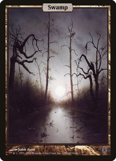
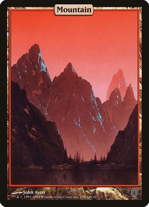
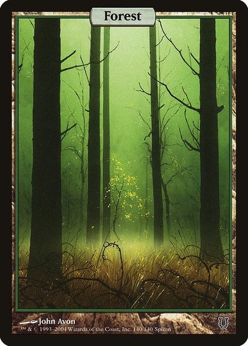
#1. Unstable Full Art Lands
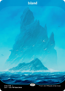
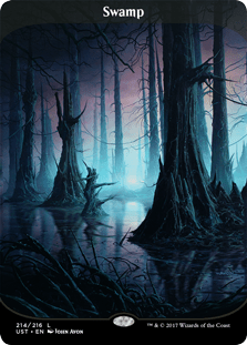
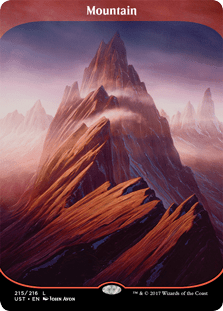
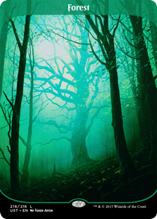
I said it. These frames make me sad. The curved motif which distracts from the art, the awkward use of transparency along the top. Nope!
And it’s a shame because these images became immediately, jaw-droppingly iconic for Magic players when they released in Unstable. These are master classes in Avon’s use of shadow and airbrushed haze to create startling depths of field, perhaps the best use we have of the full frame ratios of any card art in the game. The Swamp is lovely and eerie, and it pulls you in toward its purply glow. The Plains lovingly curves the cart track through the field with the roiling clouds to almost make your head spin if you look at it hard enough. The marching peaks of the Mountain, culminating in the mists sliding over the crags, are dizzying, and, apparently also where you happen to be standing, so don’t look down! The Forest marries Avon’s calling card of the suffused green glow and the blackish trunks in the foreground with this suddenly ominous twisting tree. A totally normal tree, really, but somehow set apart by the hazy light and the tall straight trunks of the trees around it. Uncanny and eerie and magical.
Then there’s that Island. Avon’s best Island is perhaps the game’s best: a beautiful, twisting crag, massing behind the flock of birds, stretching up over the midground waves, vanishing into the white above and the blue below.
MTG lore works with the idea that mana is a resource that flows from the land, a magic of those forms that wizards literally tap into for power. I can see myself tapping these lands for power. These lands make me want to believe it. That’s the greatness of this art.
Where Can You Buy John Avon Art?
The best place to go is the artist’s website, where you can get prints, playmats, limited releases, all kinds of things. Originals are harder to come by, and there are various auctions online from time to time, as well as at the MTG Art Market Facebook Group.
Wrap Up

Explore | Illustration by John Avon
John Avon’s art is beloved in the MTG community, and I hope this journey through his best works gives a little bit of the reason why.
What’s especially great about Avon is that I’ll bet you could generate a list of another 19, and maybe even two or three more such lists, and still have all great pieces. In fact, if you have an alternate list, I’d love to see it in the comments or on Discord.
The art has always kept me coming back to Magic, even if I’ve been away for a while, as happened when I was going to school and all that. And on a late summer evening, with nothing better to do, when we’d decide to get the cards back out after a break, I’d shuffle up a deck, not fully remembering what was in it, but looking forward to being surprised by a few old friends. You couldn’t beat dropping, say, Avon’s Invasion Plains to start your main phase, tapping it for something if you were lucky, and passing the turn: “Go.”
Follow Draftsim for awesome articles and set updates:


Add Comment