Last updated on May 22, 2025
Counterspell | Illustration by Jason Chan
Magic is a game whose objects are beautiful. I like beautiful things that aren’t parts of games. I play plenty of games with un-beautiful pieces. So a game that merges those two things is a feat, in digital gaming, board gaming, and in card gaming.
Of course, not every Magic card can wed the looks and the function seamlessly. In fact, I would argue that it’s quite a rare achievement to do so. Today we talk about the cards that accomplish that. And we’re going to call them pretty.
What does that even mean? Good question! Read on and find out how we define that term and what cards fit the bill!
What Counts as Pretty?

Clever Lumimancer | Illustration by Lie Setiawan
I’m going to hit you with 30 seconds of etymology. You are nerds. You can do it!
The roots of the term “pretty” are interesting. The term originally meant something like being clever, crafty, wily, skillful, cunning, tricky, even rogueish or sly! That started shifting to something that is elegant or well-made, which then shifted to good-looking people. But a bit of the old meaning is in there when it’s used as a modifier today meaning something like “quite,” as in “pretty scary” or “pretty cool.”
So unlike our list of most beautiful pieces of Magic art, this one’s about that neat trick when the art and the rest of the card structure just click. Every TCG has a frame that makes sense of the card as a game piece and organizes necessary bits of text. Even when that frame is removed or altered, as game players we understand enough about how the cards work to be able to bridge the gaps. Usually.
So today we look at the cards that are the best at uniting art and the rest of the card into the prettiest little rectangles you could want. There will be only one from each different frame, including special treatments, though all treatments won’t show up here (Ichor Ink, you’re on notice!). And there are a few Secret Lair cards in here, but there are so many odd and creative elements in those card designs that we could fill another whole article with that!
My first two choices will annoy you, but there is a method to my madness, so give it a chance!
#36. Amonkhet Invocations Wrath of God
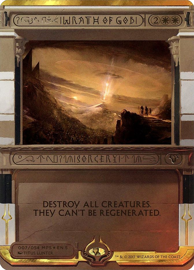
Let’s just throw down right at the start! Arguably the most reviled card style in Magic, these special Amonkhet cards, with their unreadable typeface, are not awesome. Even the revision of the style with Imoti, Celebrant of Bounty in the March of the Machine Multiverse Legends bonus sheet isn’t pretty.
But I want you to look at Wrath of God for me. The name is downright readable. And the idea of the punishment of a god, that epic Titus Lunter art and the frame itself combine into something quite pretty indeed. The frame just needs the right elements to work. This may be the only card in that group that does, but I do really like it.
#35. Collector’s Edition: Feedback
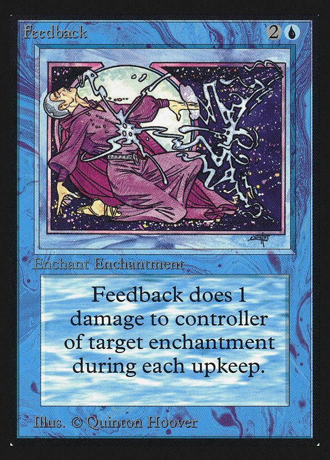
Not that Collector’s Edition! Not that feedback! 30 years before the proxy debacle, the original box of squared Collector’s Edition cards was printed, to look at and not play with, and with that horrifyingly terrible gold-bordered back. It was certainly odd to see the Alpha art we knew and loved on these odd sharp-edged rectangles, but some cards kind of stood out in that version. The dual lands with their rectangular rings in the text boxes were one. My favorite on the squared corners is Feedback. It doesn’t hurt that you can’t play these cards because it’s unplayable anyway! The sweet Art Nouveau lines in Quinton Hoover’s boxed-in art look really nice on the boxy feeling card!
#34. Double Carded B.F.M.
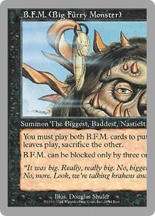
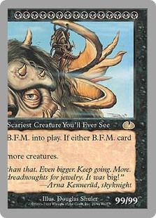
I am quite partial to the visual jokes on a lot of Un-set cards, especially Censorship, but if you’re going to name the prettiest Un card, it has to be double-wide monster, B.F.M. (Big Furry Monster) left and right halves. I can’t say the card is especially beautiful, the wicked fun Douglas Shuler art notwithstanding, but if you’ve even seen both halves together on a table, it is a joyful thing.
#33. Hedron Showcase Skyclave Shade
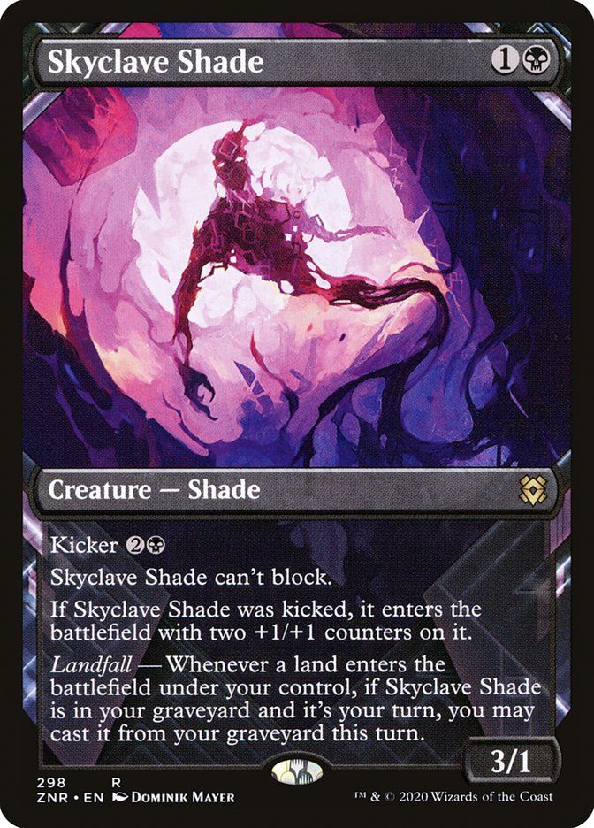
I hate almost all of these Zendikar Rising showcase cards. And when I see a brilliant one like this Skylcave Shade it bums me out a little bit for a missed opportunity. The full art with the shadowy hedron framing really makes this ethereal art by Dominik Mayer look like it’s floating back up out of death, just the way it does in the game.
#32. Pip-Boy Showcase Radstorm

If you’re gonna do Universes Beyond, then do it. And this Radstorm is doing it! The frame is totally perfect. 10/10. No notes. And the grainy CRT art by Tim Brumley? Chef’s kiss.
#31. Golden Age Queza, Augur of Agonies
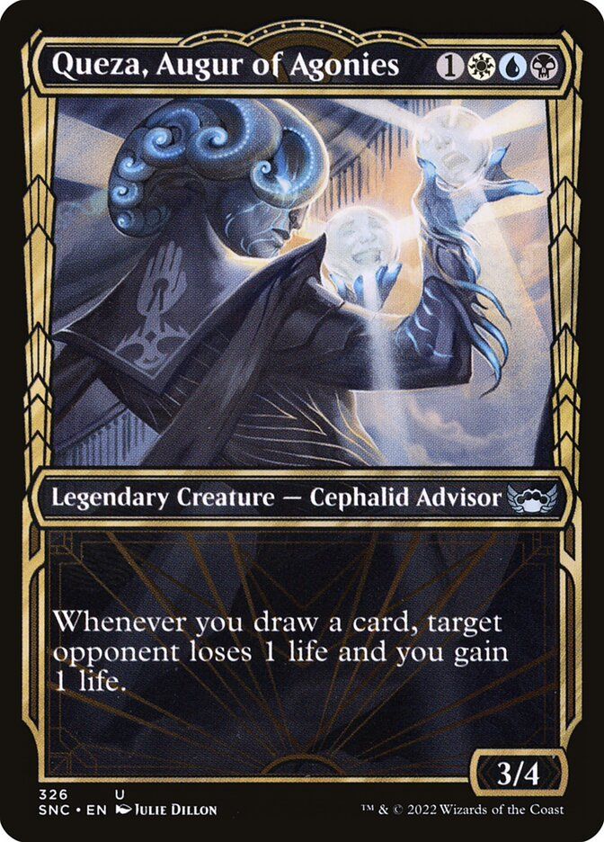
I love a lot of the art deco styling of The Streets of New Capenna, especially in the yellow proscenium-looking Golden Age frames. At its best it sets off the more simplified, almost deco style of the art without ending up in camp, like this Queza, Augur of Agonies by Julie Dillon. The muted colors, the poster-like work with light, and the terrific drain and gain conceit of the two crystal balls. A very pretty thing, indeed.
#30. Future Frame Memnite

The artifact Memnite is a famous free spell that rocks the future frame beautifully in Mystery Booster 2.
#29. Final Fantasy Showcase Summon: Yojimbo

Saga creatures condense a slick little rules text box with the vertical saga chapters on top. Cards like Summon: Yojimbo show a story from end to end with the incredible art and chapters.
#28. The Big Score Ancient Cornucopia

The frame on The Big Score‘s Ancient Cornucopia absolutely blends with Mark Poole's masterpiece and the the image puts me in the center of a time-travel epic.
#27. Full Art Dazzling Theater / Prop Room

Take your seat at the Dazzling Theater / Prop Room. Both sides of the curtain are magnificent in this horizontally played card. The blend of rooms works like a well-timed scene change.
#26. Tarkir: Dragonstorm Showcase Craterhoof Behemoth

Craterhoof Behemoth is larger than life, and the Tarkir: Dragonstorm showcase frame shows this massive card overstepping it's boundaries.
#25. Extended Art Sire of Seven Deaths

Count up the keyword abilities on Sire of Seven Deaths. This use of the borderless extended art with the seemingly tallest rules text box outside of cases and sagas is elegant and simple. Also a terrifying card to go against.
#24. Full Art, Borderless Ugin, the Spirit Dragon
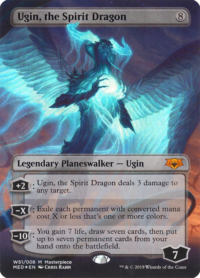
Sorry, but planeswalker frames are ugly. They make you slow down to figure out what’s going on with the card (kinda like they do to the gameplay, as well!). So I like when planeswalkers get alternate treatments. None is better than this huge Ugin, the Spirit Dragon, which could only be improved in white border. Insert Randy, Macho Man, Savage’s “Oh, yeah!!!” here, reader!
Raymond Swanland’s art is a vivid colorless storm of Ugin in his Fate Reforged pose, but the tone has been blued. Very pretty.
#23. Ring Showcase Frame Frodo, Sauron’s Bane

This version of Frodo, Sauron's Bane is perfect in the round ring frame. The frame is The Ring, Frodo is holding The One Ring, and we slowly drill our vision down past that into the dark to see it. Just like the Black Rider there, also looking, and also looking exactly the way you’d want if you’re a kid, listening to a parent read you this story at night in the waning light of the day. Andes Rocha’s art is a gem.
#22. Soft Glow Mechtitan Core
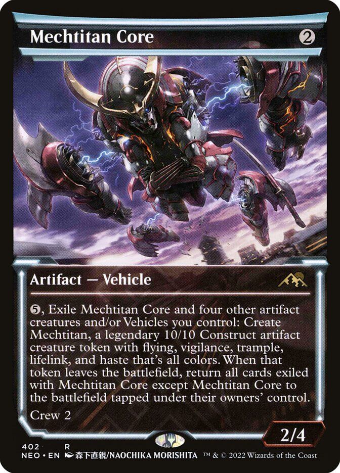
I love the idea of this frame, with the bold strips of color along the top, but the frame and the art don’t always feel like they belong on the same card. Something much better is happening with this Mechtitan Core, which uses the neon-y darkness to convey the vibe of a gritty anime while acknowledging Voltron in the sweet art by Naochika Morishita.
#21. Rulebook Showcase Clattering Skeletons
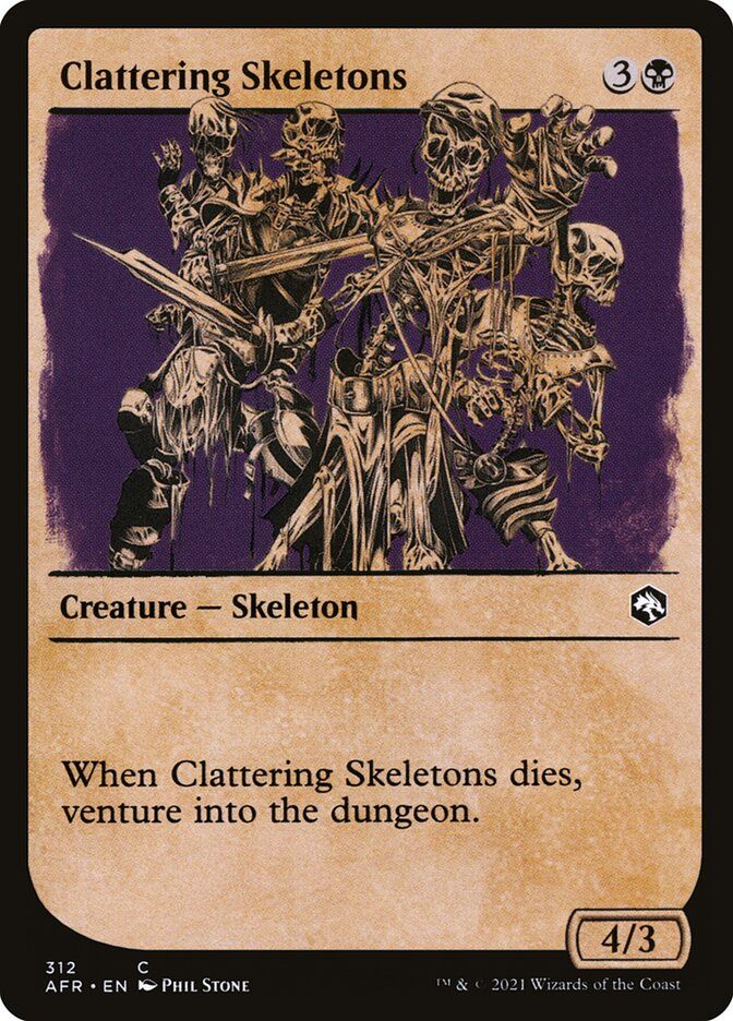
If you grew up with Dungeons & Dragons rulebooks from the 70s and 80s, these cards hit that perfect note. Even better, the small, concise bits of art in the center also remind me of the images on the bottoms of the yellowed pages of my old Fighting Fantasy books, which is how you played D&D by yourself before video games. So many of these cards are great, but I really dig these Clattering Skeletons by Phil Stone. It absolutely captures turning the page of a nerd text when you were 12.
#20. TARDIS Frame TARDIS

You know you’re thinking of the Yo Dawg meme, right?
Nothing against the regular TARDIS with lovely art by Chris Ostrowski, but in this Doctor Who card you open the door to the thing and set foot inside! The art by Dalton Pencarinha perfectly melds with the frame.
This is slow clap time.
#19. Ravnica Cityscape Niv-Mizzet, Supreme
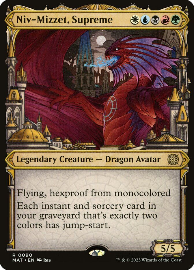
You may have missed Niv-Mizzet Supreme in March of the Machine: The Aftermath. This version, which uses the Ravnica Cityscape frame that also works so well with the Multiverse Legends Juri, Master of the Revue has some sweet pen and ink art by Isis that dovetails with the frame and looks like Niv is both folding the city within his wings and scorching it, just a bit. Perfect!
#18. Unlimited Serra Angel
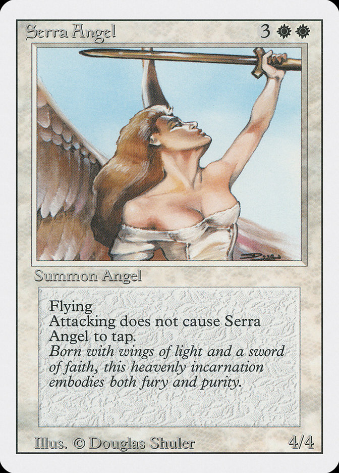
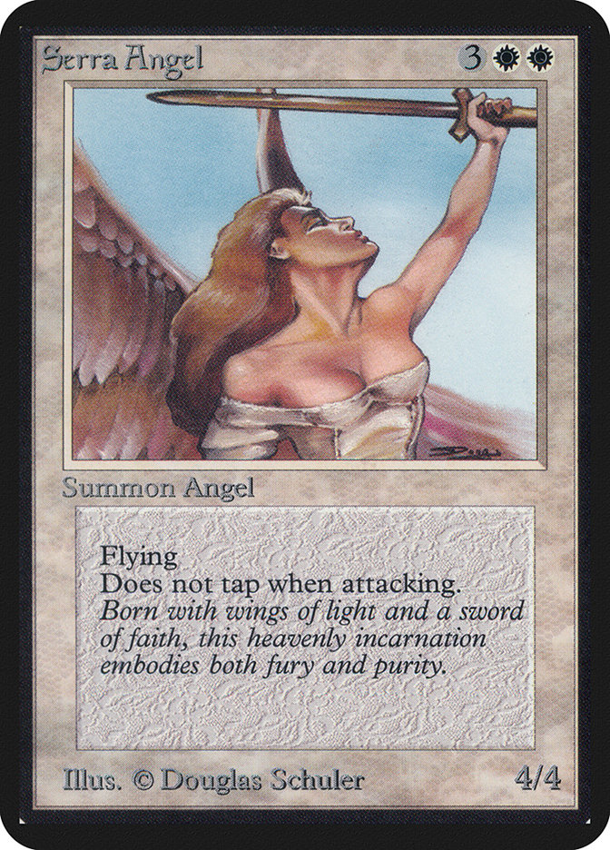
Although white borders are a bit of a hipster thing now, with sun bleaching and everything, at the time white borders just felt sad, especially because the border thickness had also been thinned from Beta, which made the card itself seem both bigger and smaller at the same time when you held the same card in Alpha or Revised and compared them.
But my fondness for white border has grown over the years and I can recognize the cards for which the white border did a service. For me the apex of that is in Serra Angel. That iconic Douglas Schuler art just looks best in white border. Look at the Unlimited Edition and compare it to the black bordered Alpha!
#17. Comic Book Sea-Dasher Octopus
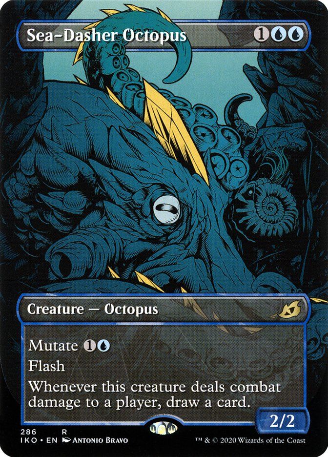
I love these animation cards from Ikoria: Lair of the Behemoths. This Sea-Dasher Octopus by Antonio Bravo is the best of many greats. Many full art MTG cards have elements that flow over the frame elements, but I think Ikoria did it best, and that tentacle here is just awesome. I love the way the colors are used for depth in this moody piece.
#16. Stained Glass Arcades Sabboth
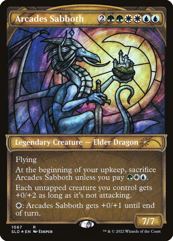
Everyone loved the stained glass lands by Magali Villenueve from Dominaria United, as did I. But I think the best stained glass card is this Secret Lair Arcades Sabboth by Eshpur. I know I have the Magic boomer love of a bad card he cracked in a Chronicles pack, but making the lord of walls functionally inert as a window is dead hilarious to me. That’s definitely the joke, given how the pose references Even Amundsen’s art for Arcades, the Strategist.
#15. Sketch Frame Archon of Cruelty
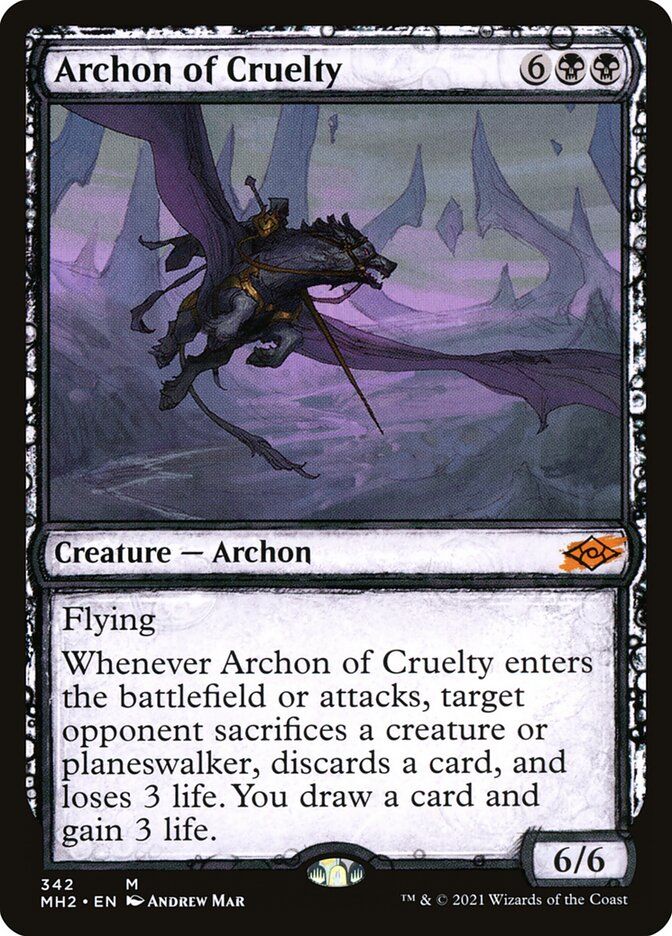
Showcase frames of various kinds wax and wane in popularity, and the sketch style from Modern Horizons 2 tends to be somewhat unpopular. But I love the way it works on Archon of Cruelty down to the red slash for the mythic on the set symbol. This different version of Andrew Mar’s art (without the antlers!) is more interesting to me. And I love the way the simplest watercolor washes and the darker elements overall interact with the darker notes in the sketch frame.
#14. Eighth Edition Ivory Cup

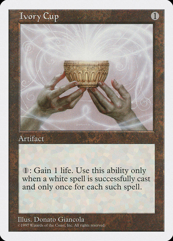
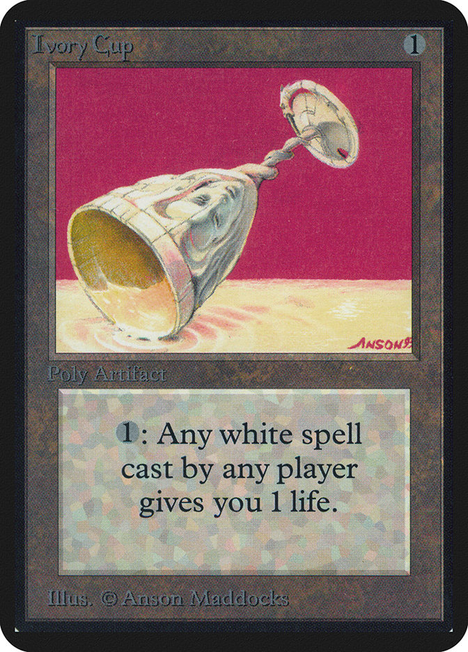
I know people who stopped playing Magic with the new frame introduced in the Eighth Edition. They’ve made some tweaks to the form of what are basically today’s Magic cards, but that frame, on the last core set that was white bordered, was a shock back in the day. They darkened the artifact frame with Fifth Dawn to differentiate it visually from the white frames, so the artifacts in this set are totally unique in their look. My favorite is Ivory Cup. Compare how the Fifth Edition Donato Giancola art looks compared to its first printing in Alpha and you can see the new frame and colors give it a lovely washed out, ethereal quality.
#13. Innistrad Eternal Night: Plains
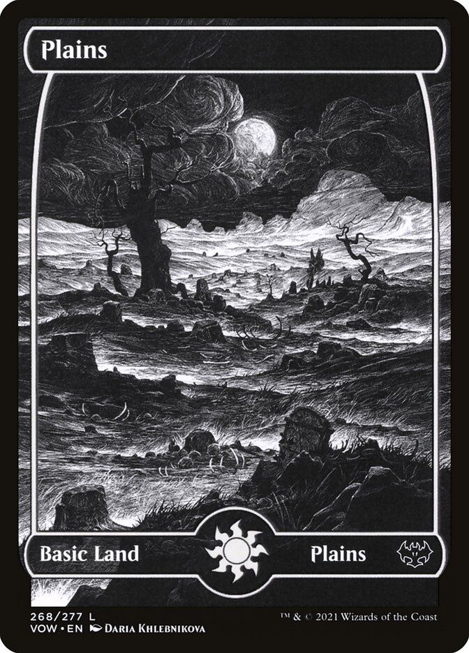
You’d think I’d be picking a Swamp, but as a horror fan, I love the more low key creepy factor of Daria Khlebnikova’s scratchy pen and ink art in the full black-and-white frame of this Plains. I especially love the effect of the moon shining through the branches over this graveyard. And who builds a graveyard in a swamp, knowingly anyway?
#12. Life of Toshiro Umezawa
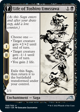

There are some amazing illustrations and amazing stories behind the artworks for Sagas, a card type created for 2018’s Dominaria. They’re thin and vertical, often tell a story with parts in that small space, and usually create an experience in the art to replicate the MTG culture which would tell this tale, as in the mosaics in Elspeth Conquers Death. But for me the spare ink art from Sidharth Chaturvedi is just beautiful. And the way it dances across the panel, disrupting the saga counter progression, which replicates the duplicated first two steps with their Umezawa's Jitte choices, is perfect. And the way that black on white style interacts with any Saga card’s potential visual downfall, the giant strip of whitish text box down the left, and the black frame and border. Pretty as you could want.
#11. Gold Border City of Brass
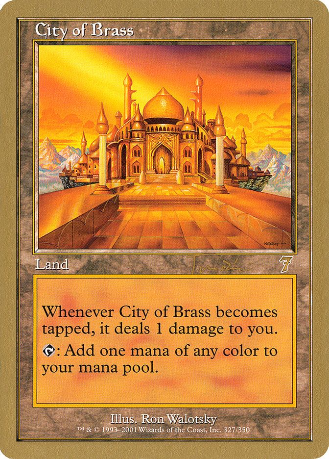
WOTC made special gold-bordered cards for the Pro Tour Collector sets and the Magic World Champ decks. They had different backs and still aren’t legal for tournament play, but everyone I know who has these uses them for Cube or Commander. The gold looks horrifyingly bad on most cards, but it’s just absurdly pretty with the Seventh Edition Ron Walotsky art on the old rocky-colored lands frame in City of Brass. The shine of the building, Jan Tomcani’s restrained signature, even the gold 7 set symbol, it all just vibes as the prettiest version of the City.
#10. Viking Showcase Tergrid, God of Fright
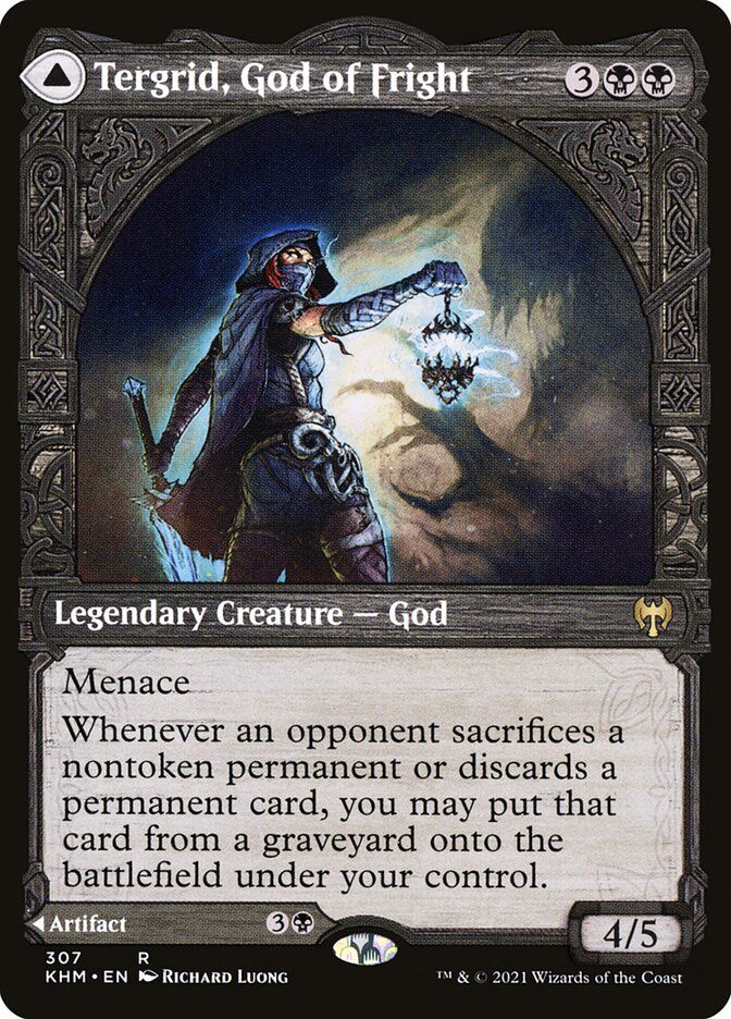

The Kaldheim Viking Showcase frames, probably inevitably, look like you’re entering a portal to a never-ending death metal show. And the art that highlights that doorframe quality like on Richard Luong’s Tergrid, God of Fright is the best use of the frame. Tergrid is almost turned to tell us to hurry up. What are we? Scared?
I also love the way the frame shifts on the back with Tegrid's Lantern, as if you’ve lit it up, perhaps to your peril.
#9. Borderless Skullclamp

Borderless cards are sometimes just, like, sorta, maybe, I guess better. And although there are a million Secret Lair cards that look fantastic, I’m pretty partial to this Skullclamp from Yoji Shinkawa. The way the cyborg edges fly off the card gives that cyberpunk feel while also evoking the function of the Clamp on your battlefield.
#8. Full Art Swamp
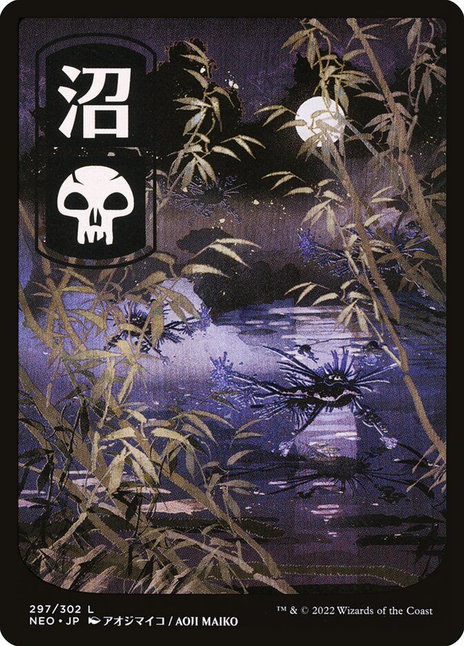
I’m going to need you to take a deep breath and count to 10. I’m not selecting John Avon’s amazing art from Unhinged.
(Remember to breathe).
I don’t like the frame of those lands and how it interacts with the art. I want to see those properly borderless. Until then, for my money, the prettiest combination of the art and frame style for a full art basic is in Maiko Aoji’s Swamp from Kamigawa: Neon Dynasty. The frame isn’t intrusive and the whole thing just has a feel that surpasses the various parts.
#7. Storybook Twining Twins

I love all the Wilds of Eldraine Storybook frame cards, but I’m quite partial to Twining Twins with the alternate art by Alayna Danner. The inky art has a beautiful depth, and the blue curving skeins of twine feel like they are looping up and around the card.
#6. Brothers’ War Schematic: Ornithopter
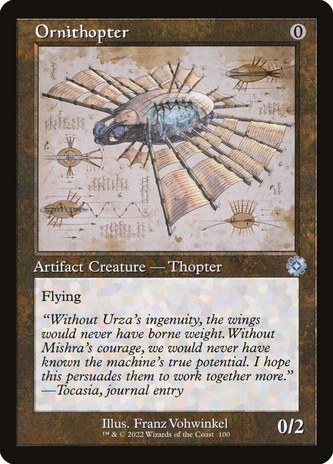
There was a lot of love for the Retro Artifacts from The Brothers’ War, with the return of the old border with that brown artifacts frame. But the schematic view versions were just a joy. I was lucky enough to crack a pack with the schematic Mox Amber, but the best of the lot is the one that calls out to Leonardo da Vinci’s sketchbooks the most clearly, the sublime Ornithopter by Franz Vohwinkel.

Honorable mention to Howling Mine, with Easter-eggy art by Mark Poole and great new flavor text!
#5. Mystical Archive: Counterspell
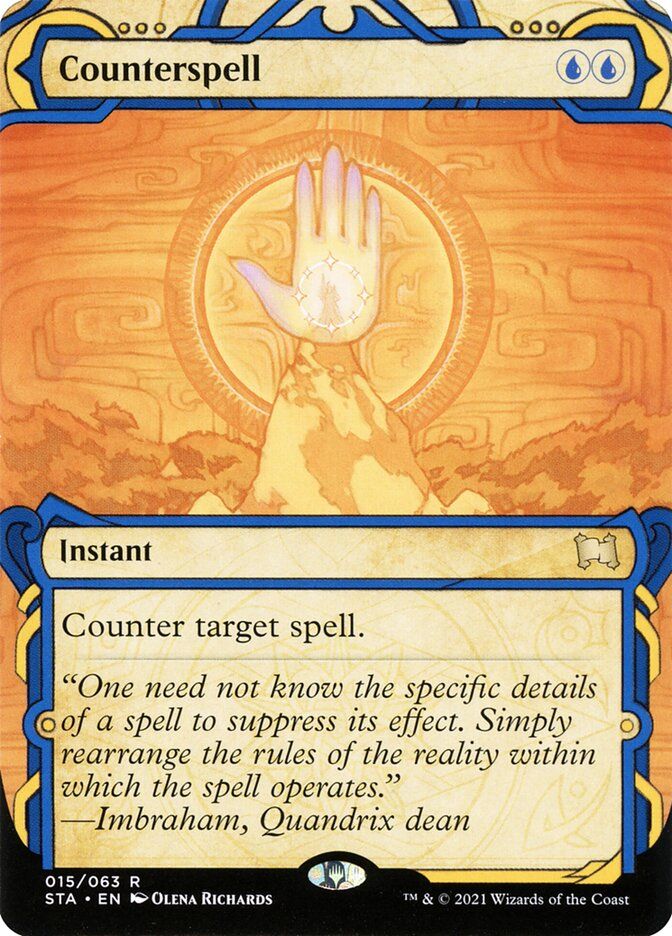
The yellow Mystical Archive frame is something I like a lot, but it doesn’t always hit right with the art. This yellow and blue impact statement from Olena Richards is a Counterspell for the ages. When I counter a spell, I want it to feel countered, and this is as close to a traffic sign, replete with raised hand, that you get in MTG!
#4. Enchanting Tales: Fraying Sanity

I love this series of cards so much! I had such a hard time choosing a favorite, but on reflection it’s got to be Fraying Sanity. Meel Tamphanon’s art, like all the midcentury storybook styles in this series, hits those nostalgia notes while also feeling like an organic part of the border treatment. This Enchanting Tales card is also a lovely piece of art, which sucks you into its depths, teasing you with the idea that there might be a face in the gap in the center, as you find yourself staring just a bit longer than you thought you would….
See, you just milled a whole minute there, card viewer!
#3. Textured Foil Jeweled Lotus
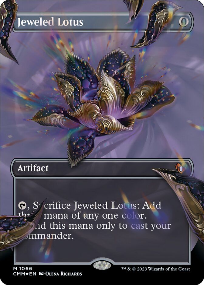
The is the only foil on the list, not because foils aren’t beautiful, especially now that WOTC is making a bunch of different kinds that don’t turn as easily into Pringle shapes, but because beautiful and pretty are not the same thing. A pretty foil would connect with the rest of the card in the best possible way, and sometimes it does that. Sometimes it’s just a foil draft common.
Jeweled Lotus in textured foil is perfection. Take a look. The way the foiling shine connects with the bright central Lotus and the blurred edges of the art are fantastic. And of course the card itself represents the ultimate shiny bauble, literally a Jewel of a card.
#2. Beta Lightning Bolt
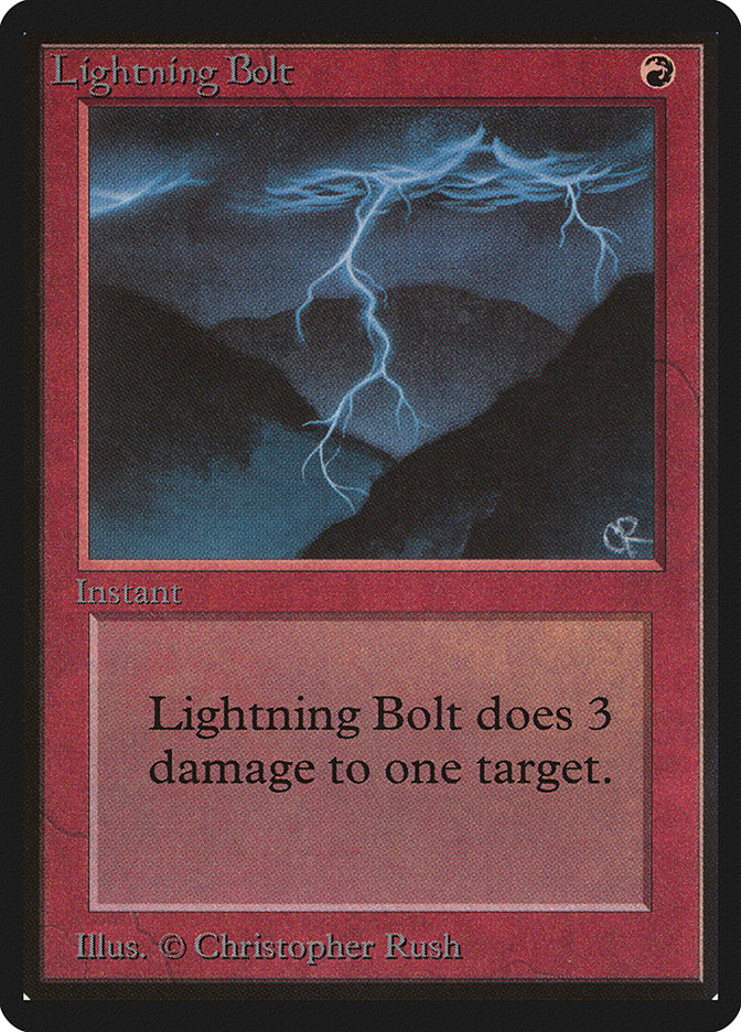
A favorite amongst the Draftsim crew, the Beta Lightning Bolt makes the most of the old card style. The colors of Alpha and Beta cards could be muted, which is to the detriment of black cards, specifically, but that fade, coupled with the three dimensional beveling around the art and the text box, gives red cards, specifically, just a really nice pop in that thicker Beta frame. And Lightning Bolt, with that hazy, gloomy, Christopher Rush artwork, is the perfect Beta card.
#1. Alpha Black Lotus
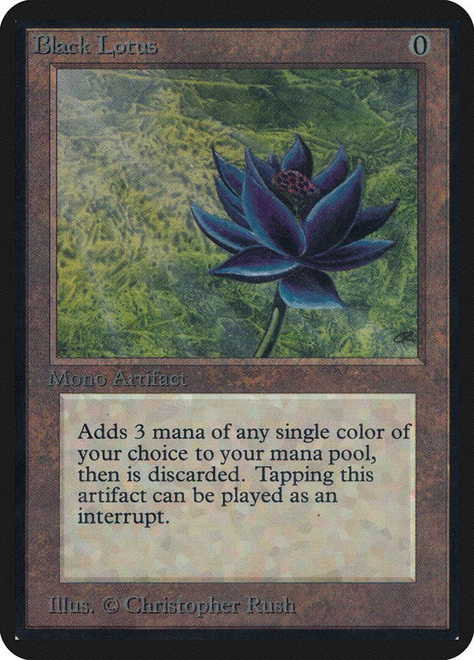
Is there a prettier item in gaming? And are we biased by the most expensive prices and history? Yes. And yes.
Alpha cards, if you haven’t met one in person, have more rounded corners and a thicker frame than cards which come later. That gives them a distinct look and feeling of weight that can only match the allure of the Alpha Black Lotus. With that original brown artifacts border, the big white art copyright on the bottom and the off-center composition by Christopher Rush, Magic’s most iconic card is a thing of beauty to this day, sullied only by the existence of the 30th Anniversary proxies.
Wrap Up

Lightning Bolt | Illustration by Anato Finnstark
So that’s pretty much it! Did I miss anything? The original Dryad Arbor in that Future Sight frame, maybe?
I’m sure you’ve got a few cards I missed that fit our definition of pretty and that embody that special connection between game piece and design. If so, let us know in the comments or on Draftsim's Discord. What’s your prettiest card?
Follow Draftsim for awesome articles and set updates:


1 Comment
Love the Cephalids! But I feel like Seb McKinnon’s Farewell is pretty
Add Comment