Last updated on March 17, 2026
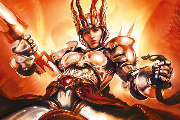
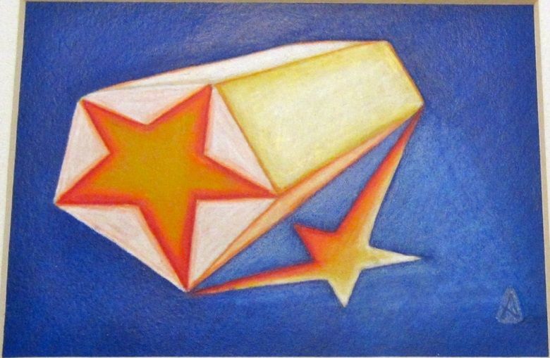
Worst Fears | Illustration by Eric Deschamps
Card art is a fundamental part of Magic. It’s both a visual representation of what the card does and a cohesive and immersive way to throw players into the worlds and lore of the game. It’s as much part of the game’s design as the lore or the card’s flavor.
Not all card art is created equal. Almost any Magic player has at least one favorite bad card art, if not many. There’s a more consistent level of quality in Magic’s art these days, but there are still some outstanding (derogatory) ones here and there.
A few things before getting started. This list isn’t meant to attack or critique the artists who made these cards or their entire body of work. They are fundamental in shaping the way Magic looks today, but these cards aren’t it. It’s all in good fun. Most of the cards here are from older sets, but not because old Magic art was all around worse or anything. Magic’s visual language has become more consistent with time, so most of the errors and “ugly” things in newer art are more technical and harder to detect like subtle anatomy mistakes or strange composition choices. Mostly, we're looking for admitted mistakes in the art, weird choices made by the artists, or instances where the art doesn't totally represent the card.
Besides, I love unconventional, abstract, and weird art in cards. Cards like the Mystical Archive’s Faithless Looting or Stasis are usually brought up when bad art is mentioned, but I personally think they’re amazing. Leaving aside the economic part of it, I think having things like Secret Lair and all these alternate art cards is a great way to showcase less conventional art while keeping the main set’s visual language coherent.
Dishonorable Mentions
Invoke Prejudice by Harold McNeill
This is the only real inexcusable art on this list and truly deserving of the title “dishonorable.” A few years ago, Wizards issued a global ban on a series of cards that had racist connotations either in their art, name, or mechanics. Invoke Prejudice easily stands out as one of the worst offenders for plenty of reasons.
Aside from its name, this card’s effect counters creatures that are a different color from creatures you own. Its art depicts shapes that resemble KKK outfits with an executioner’s axe. The card’s artist has also been accused of being a neo-Nazi and a white supremacist due to the overt Nazi symbology in plenty of his art. The card’s collector number is 1488, a neo-Nazi dog whistle. It’s plain terrible on every level. Wizards stopped working with McNeill years ago and have moved away from this unfortunate card.
I’m not against controversial art or art that may push some of Magic’s limits. There’s a line to be drawn between controversial art and art that evokes racist imagery. The technical part of this art may not be all that bad, but its content is, and that makes it worth mentioning.
Ruthless Technomancer by PINDURSKI
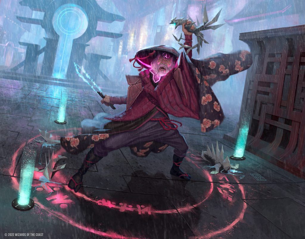
Ruthless Technomancer | Illustration by PINDURSKI
I stared at it for several minutes when it was first spoiled, trying to understand what I was supposed to see on the character’s face. I ended up searching for Ruthless Technomancer’s full art to understand it.
The original art was clearly good but for some reason the face looks all smudged on the card and it makes it extremely hard to understand.
Hyalopterous Lemure by Richard Thomas
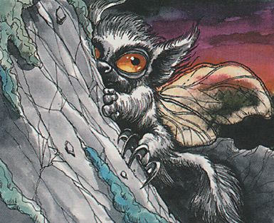
Hyalopterous Lemure | Illustration by Richard Thomas
The art on Hyalopterous Lemure is extremely cute and well-drawn. The only problem is that the original artist was never informed that lemurs (the cute ring-tailed primates) and lemures (the D&D demons based on Roman myth) aren’t the same. What should’ve been a horrifying undead beast ended up as one of the cutest creatures with 4 power in the entire game. Viscid Lemures’s flavor text is a fun callback to this funny mistake.
Fun fact: Lemurs are named after the lemures of myth because of the haunting sounds they make and their shining eyes. Richard Thomas can argue he made no mistake here.
Forest Bear by Wang Yuqun
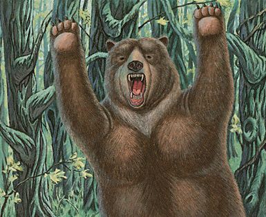
Forest Bear | Illustration by Wang Yuqun
I may not live in a country where bears are native fauna, but I’m pretty sure they don’t usually look like a guy in a flat bear suit. I have to admit that the fur on Forest Bear looks pretty fuzzy though.
Niall Silvain by Christopher Rush
Niall Silvain | Illustration by Christopher Rush
I suppose the art on this card isn’t exactly bad on a technical level, but I swear I’ve had nightmares about this face. Old Magic was full of cards with body horror and abstract nightmare creatures, but Niall Silvain somehow manages to be creepier than most of them.
Karn Liberated by Mark Tedin
Karn Liberated | Illustration by Mark Tedin
Thinking of Karn only brings me sadness nowadays thanks to Dominaria United’s story. There was a beautiful time when my latest memory of the silver golem was Karn Liberated’s alternate art in Double Masters, where he looks like he’s attempting Dark Souls’ “well, what is it?” gesture.
Universes Beyond
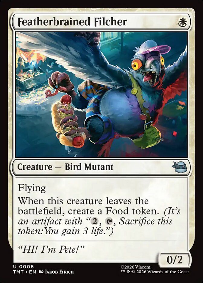

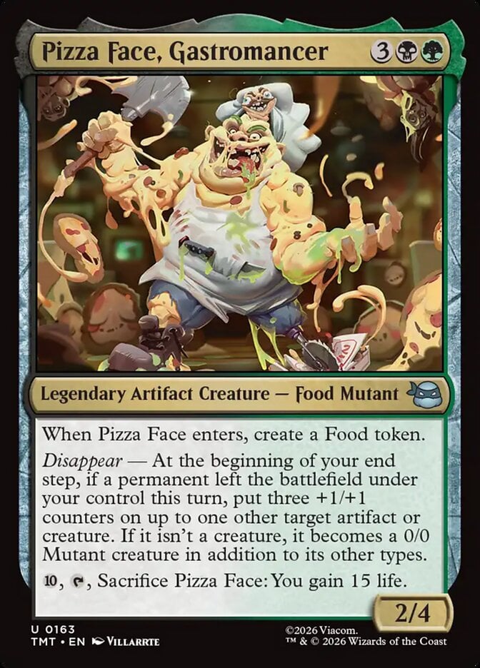
Of all the Universes Beyond hate out there, art is often not the issue on the Standard-legal cards, but for many, the grossness from Teenage Mutant Ninja Turtles on cards like Featherbrained Filcher, Omni-Cheese Pizza, and Pizza Face, Gastromancer is just too much.
Source Material
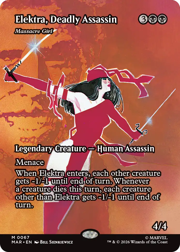
Some players really dislike the screenshots and transplanted material. I've nothing against comic books or MARVEL, but Elektra, Deadly Assassin feels very out of place on a Magic card.
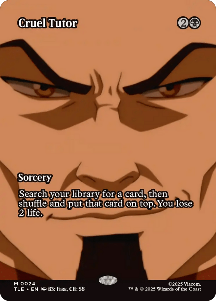
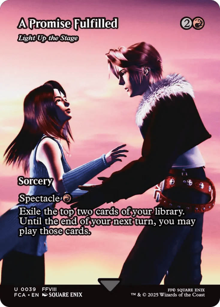
I'm a huge fan of close ups and the Avatar: The Last Airbender series, but the Cruel Tutor started to lose detail where Ozai's Cruelty and Ozai, the Phoenix King look fantastic. I also love video games, but there's an emotional connection that is lost when you disconnect your control of the character and try to pass off A Promise Fulfilled as art.
#26. Indestructible Aura by Mark Poole
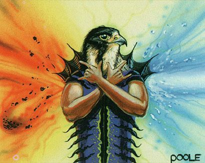
Indestructible Aura | Illustration by Mark Poole
This card’s art is more baffling than it’s bad per se. I suppose it technically shows what the card does more or less correctly, but I don’t think Magic’s ever had a creature type that looks like a mix of bird and fish. Using the sign of the horns to ward off hostile magic is something that I find honestly charming.
#25. Keldon Warlord by Kev Brockschmidt
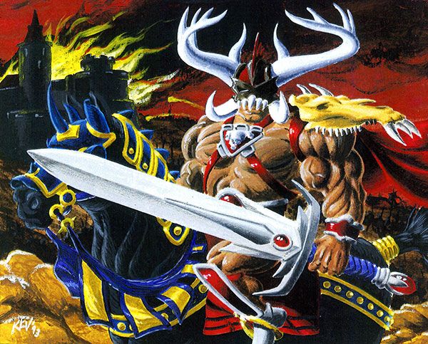
Keldon Warlord | Illustration by Kev Brockschmidt
The Keldon are an imposing and threatening race of warriors. Keldon Warlord is no exception to this… if you don’t look at his legs. Don’t skip leg day.
#24. Skyknight Legionnaire by Anthony Palumbo
Skyknight Legionnaire | Illustration by Anthony Palumbo
Skyknight Legionnaire’s art has a weird camera angle. This card had a previous art that served as worldbuilding. The original art showed the knight, the mount, the Boros legions marching down below, and several imposing buildings. This new art doesn’t even show the knight’s mount, which makes for a very sudden downgrade.
#23. Unholy Strength by Douglas Shuler
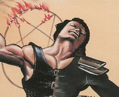
Unholy Strength | Illustration by Douglas Shuler
The overall art quality of this card isn’t terrible except for the awkwardness in the character’s pose and the fact that the art doesn’t say much. What makes me mad about Unholy Strength is that it originally conveyed much more thanks to a blazing pentagram in the background.
Wizards had to remove it due to pressure related to the satanic panic, and it made the art much worse for it. Another victim of this was Demonic Tutor, but that still makes perfect sense without the pentagram.
#22. Mongrel Pack by Jeff Miracola
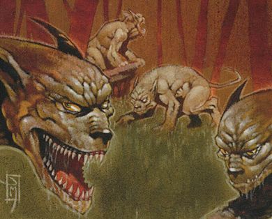
Mongrel Pack | Illustration by Jeff Miracola
The art would make sense if it was supposed to depict some weird monster, or even goblins. Mongrel Pack’s creature type is dog. This is not how dogs that aren’t mutants or demons look.
#21. Urza’s Mine by Anson Maddocks
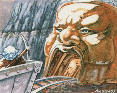
Urza's Mine | Illustration by Anson Maddocks
This is far from the worst art in the game, but it certainly gets a giggle out of me every time I see it. The Urza Lands were extremely powerful at one point, but it’s hard to take them seriously when you’re being stared at by a funny little blue goblin. This version of Urza's Mine is by far the funniest of all its reprints and alternate arts.
#20. Deadlock Trap by Jason Rainville
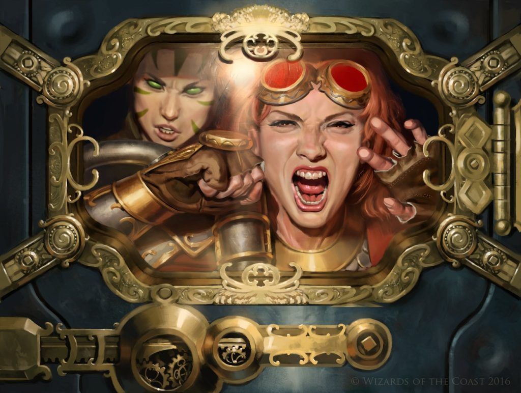
Deadlock Trap | Illustration by Jason Rainville
Deadlock Trap is another great example of things that aren’t obvious at first sight. If you just glance at the art, it looks great and communicates the card perfectly. Once you start looking at the proportions on Chandra and at Nissa’s face, things start falling apart a little.
#19. Scourgemark by Franz Vohwinkel
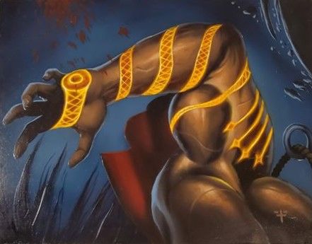
Scourgemark | Illustration by Franz Vohwinkel
At first glance, Scourgemark doesn’t look bad at all. It's as soon as you try to understand where the arm connects that you realize that it’s not really going into a body but rather looks like it has another elbow.
#18. Flash by David Ho
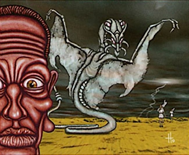
Flash | Illustration by David Ho
I have to credit this entry to my girlfriend. She knew I was looking for cards with bad art and showed me this one, saying: “It looks as if someone wanted to take a picture of a terrible event but some guy accidentally walked into frame right in that moment.” Flash is possibly the first and only Magic card art that got photobombed.
#17. Sorrow’s Path by Randy Asplund-Faith
Sorrow's Path | Illustration by Randy Asplund-Faith
The characters on this card look relatively fine. They have weird poses, but that’s not all that bad. There are more than two characters in this art, and that’s where it gets funnier. I relate to Sorrow's Path background dragon on a personal level.
#16. Amulet of Quoz by Dan Frazier
Amulet of Quoz | Illustration by Dan Frazier
I don’t even know what the idea was behind the design of Amulet of Quoz. Especially considering this isn’t from an Un-set or any kind of joke card that may justify it somewhat. At least ante is completely banned from the game, so there’s no chance of seeing this card out there.
#15. Olivia Voldaren by Eric Deschamps
Olivia Voldaren | Illustration by Eric Deschamps
Innistrad’s art was one of the main selling points for the set. It’s still complimented today for how well it set the world and for the horror feel of it. Olivia Voldaren’s art was as evocative as the rest of them. The problem comes from the fact that it may seem like her knee is up in the air, but you’ll notice on closer look that both of her legs are stretched and that she’s not really grabbing her dress.
The artist, Eric Deschamps, explained that he had originally made some final tweaks that made the legs look better, but he saved the final art to the wrong drive. He sent the pre-tweak art in, and that’s what got printed.
#14. Chains of Mephistopheles by Heather Hudson
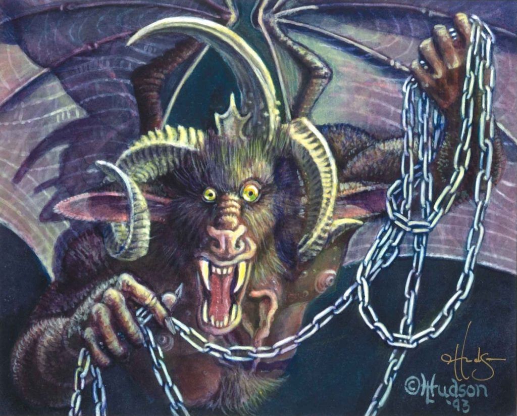
Chains of Mephistopheles | Illustration by Heather Hudson
Honestly, I have that same face after I look at Chains of Mephistopheles’s price and try to read its effect at the same time. I think this was one of the first cards that come to mind when I think “funny and bad MTG art” because it was one of the first ones I saw.
#13. Nicol Bolas and the Other Elder Dragons by Edward P. Beard, Jr. and Andi Rusu
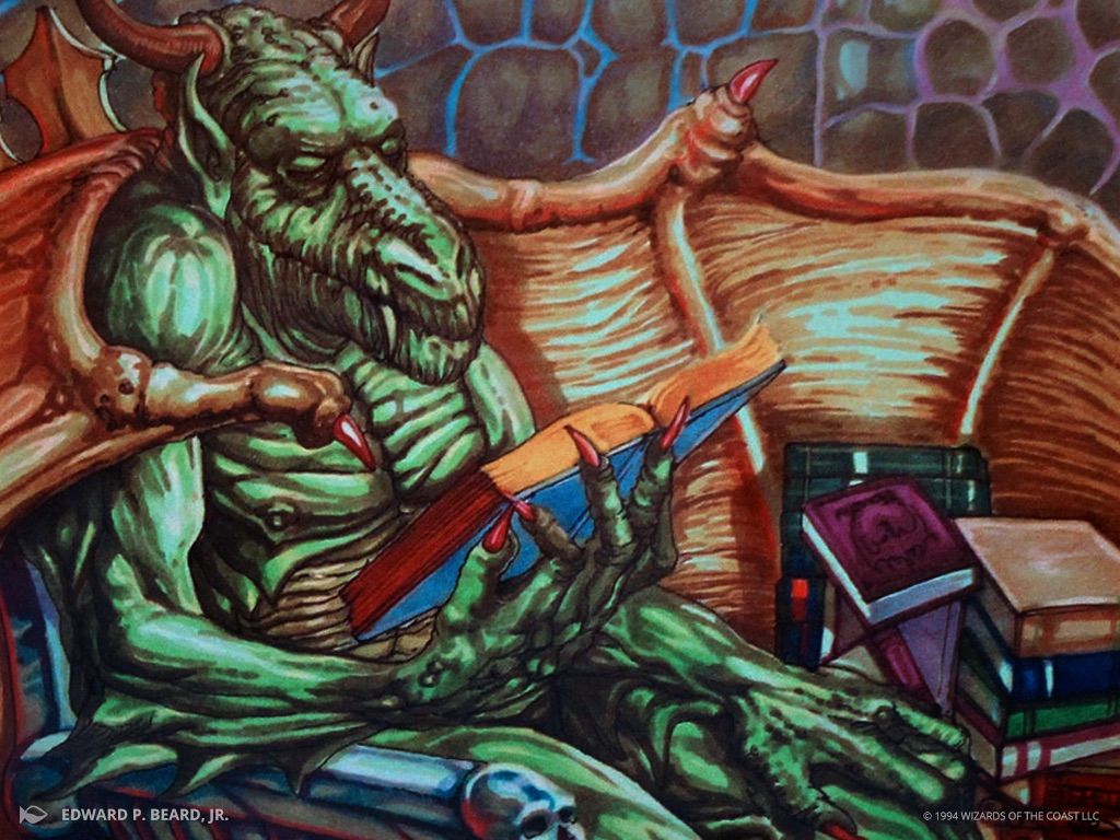
Nicol Bolas | Illustration by Edward P. Beard Jr.
One would expect the cards that give Commander its original EDH (Elder Dragon Highlander) name would have some kind of imposing and particularly threatening art. They aren’t the worst, all things considered, but most of these dragons just look goofy.
I think Palladia-Mors and Chromium were lucky enough to not have it so bad. Arcades Sabboth looks a bit rougher around the edges, and I personally think it’s the one that looks the least like its color identity. Vaevictis Asmadi is the only one drawn by another artist and ends up feeling kinda out of place. It also has some slightly weird proportions. Nicol Bolas looks all wrinkled for some reason.
All of these dragons got new interpretations in Core Set 2019 that depicted them better and with more useful effects by today’s standards. Almost all of them retain some likeness to their old depictions. Nicol Bolas is the only exception, and it’s that retroactive inconsistency what makes me judge the old art a bit more harshly.
#12. Wood Elemental by Brian Snoddy
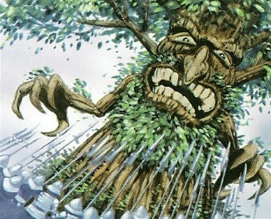
Wood Elemental | Illustration by Brian Snoddy
The depiction of both elemental and treefolk creatures has come a long way since Wood Elemental was in rotation. Let’s all be thankful for that because this tree’s face creeps me out.
#11. Frog Tongue by Phil Foglio
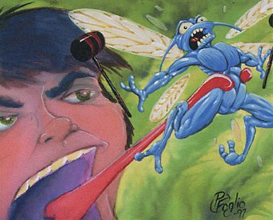
Frog Tongue | Illustration by Phil Foglio
I’m a huge supporter of the art that the Foglios did for Magic. Phil and Kaja Foglio tend to get a bit more hate than others because of their cartoon-y style. It feels out of place in Magic’s current visual language, but they still made some incredible art for a lot of really timeless cards.
Still, I think Frog Tongue isn’t exactly their best. Beyond the cartoony style, there’s a weird feel to the face that makes it look pretty bad.
#10. Mwonvuli Ooze by Zina Saunders
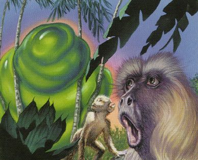
Mwonvuli Ooze | Illustration by Zina Saunders
I really like that the stickers that reference memes in MTG Arena. I won’t be happy until there’s a sticker of Mwonvuli Ooze’s monkey to use as a poggers sticker.
#9. Word of Command by Jesper Myrfors
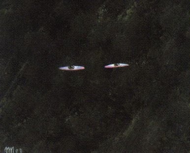
Word of Command | Illustration by Jesper Myrfors
This card has a really convoluted effect that certainly doesn’t feel like it should be represented by just a pair of eyes in darkness. You could argue that Word of Command lets you control a player’s actions like some kind of shadowy manipulator, but I honestly would’ve liked at least a bit more detail.
#8. Gabriel Angelfire by Daniel Gelon
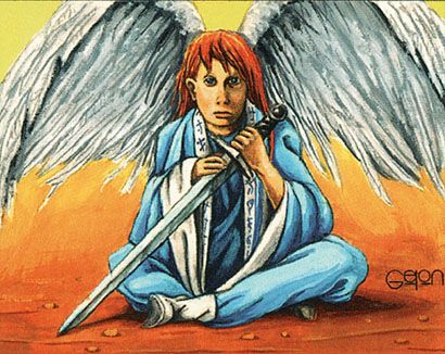
Gabriel Angelfire | Illustration by Daniel Gelon
A common complaint among Magic fans is that a lot of the legendary creatures from Legends had art that was hardly enticing. Among all of them, Gabriel Angelfire stands out. It’s especially noteworthy that until the Amonkhet block, this was the only non-female angel along with Malach of the Dawn.
#7. Unholy Strength by Gary Ruddell
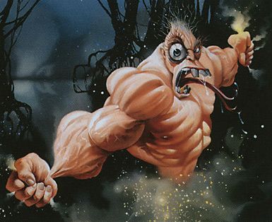
Unholy Strength | Illustration by Gary Ruddell
It’s back! The pseudo-Earthworm Jim look of this card haunts me now. I think the best way to explain Unholy Strength’s weird and out of place art is by comparing it to Muscle Burst from the same artist. Both the name and the effect on the second card evoke a more “body getting swollen in a dramatic and absurd way” kind of feel. Every other art for Unholy Strength hints at a more subtle and esoteric kind of power up instead of mutating proportions.
#6. Disruptive Student by Randy Gallegos
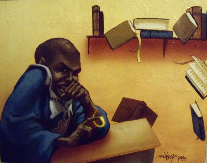
Disruptive Student | Illustration by Randy Gallegos
This card’s art has had some criticism throughout the years. The character’s cartoonish and distorted face can easily be seen as a problematic kind of representation (to say the least). There’s also no reason why it should look so evil and contorted.
Worse, the flavor text seems to hint at the Disruptive Student actually being Teferi (most players read it that way, at least). I’m glad the game has moved into more flattering depictions of its non-white characters.
#5. Gift of the Woods by Susan Van Camp
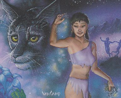
Gift of the Woods | Illustration by Susan Van Camp
Both arts for Gift of the Woods were made by the same artist and clearly depict the same idea through opposites. You could get nitpicky with the #92b version of the art, and it’s #92a’s cat that really makes it shine. I have no words to describe how much I adore that cat’s face.
#4. Balduvian War-Makers by Mike Kimble
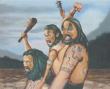
Balduvian War-Makers | Illustration by Mike Kimble
The release of Dominaria United brought Balduvian Atrocity, which depicts a Balduvian barbarian turned into a grotesque example of amazing body horror. I’d hardly call it the first Balduvian monster, though. Balduvian War-Makers could easily show up in a David Cronenberg film.
#3. Uktabi Orangutan by Una Fricker
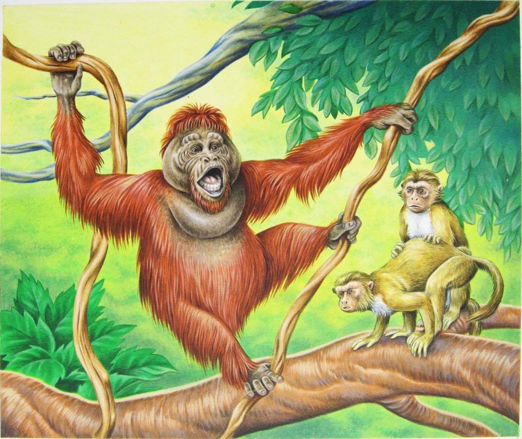
Uktabi Orangutan | Illustration by Una Fricker
Magic is technically a game for people 13 or older. Let’s just say that Uktabi Orangutan comes dangerously close to changing that thanks to those monkeys in the background.
It’s made better because Uktabi Kong makes fun of both this card’s art and Gorilla Titan’s flavor text–one of my least favorite pieces of flavor text in the entire game.
#2. Reverse Polarity by Justin Hampton
Reverse Polarity | Illustration by Justin Hampton
I don’t want this to come across as excessively mean to either part of this, but the art on Reverse Polarity looks the way the old Neopets art looked. The lighting and shading create a very particular effect that makes the figures look odd and plastic.
#1. Celestial Prism by Amy Weber
Celestial Prism | Illustration by Amy Weber
I’m not entirely sure what shape I’m supposed to be making out of this art. Amy Weber has made some amazing art for artifacts like Life Matrix, Urza's Avenger, or Astrolabe that look almost like diagrams, or like an image you could find in a text about that artifact. Celestial Prism’s art is even more surprising because it’s far from what she’s clearly very capable of doing.
Wrap Up
Bad Ass (Unhinged) | Illustration by Thomas M. Baxa
Just to drive the point home, I actually respect (almost) all of these artists a lot. I know how hard making art can be and how a minor mishap can make a whole piece look weird or unbalanced.
Magic has a long history filled with tons of different artwork and art styles. Most if not all of these artists have worked on dozens of cards each, so it’s to be expected that at least one of them will turn out less than ideal. It also means we shouldn’t fixate on those pieces and miss out on their other works.
But enough about me! What are your favorite bad card arts from Magic? Do you think I missed any card that could’ve made it into this list? Let me know in the comments below or over on the Draftsim Twitter. You can also join our Discord to join our amazing community!
Have a good one, and I’ll see you next time!
Follow Draftsim for awesome articles and set updates:


12 Comments
Correction: Gabriel Angelfire wasn’t the only non-female angel creature before the Amonkhet block. Guardian Angel from the Alpha Edition was the first non-female angel creature, coming before both Gabriel Angelfire and Malach of the Dawn.
Hey Brenda… are you sure? I can’t quite make out what Guardian Angel is supposed to be. Is there some official wotc/maro content on this?
Hello Jake, Brenda is correct, the illustration on Guardian Angel is indeed male. If for some reason wotc wants to say otherwise, then they are making it up after the fact, which is their right. But this was done before wotc made any attempt to steer the conceptual aspects of the artwork. I didn’t want the gender to be immediately obvious but male if it had to be decided upon. Most of the artwork from that period can be explained by the artists and anything else about it is wotc post hoc connective tissue.
Thanks for the dialogue!
Thanks for the clarification! Always wondered about that card…Think I read that angels were not specified as having any gender at all as they are essentially celestial beings that predate that physical aspect. BTW you’re one of my all-time MTG artist favorites, along with the other more horror-oriented original artists like Spencer and Tedin. Great work.
I am quite sure! I’m married to the artist of Guardian Angel, Anson Maddocks, whom I would consider to be the highest authority on the gender of the angel depicted in the artwork. I could be mistaken but, I don’t believe Mark Rosewater was even around yet for the Alpha set. Jesper Myrfors was the art director then and artists were given complete freedom to create whatever image they conceived based solely on the title of the card. (There was no continuity of a unifying story line to adhere to. Not even a card’s color nor mechanics nor flavor text were known when the Alpha art was created.) And so, only Anson Maddocks would be able to speak to the official narrative about Guardian Angel’s gender. I, too, had made the mistake of assuming it was a female because of the longer hair length, but Anson gently corrected me by asking, “What makes you think Guardian Angel is a she? Aren’t angels neither male nor female?” He went on to explain his intention was to ambiguously depict a divine creature of neither gender but then hinted that, if anything, it was a representation of an aspect of himself. Certainly “non-binary” and without a doubt “non-female” 🙂
Well… all I can say for this list is art is in the eye of the beholder. personally, I think some of the best and most iconic art from Magic’s history somehow found its way into your list. Instead of ripping it apart, I’ll say this: The worst is easily Faithless Looting from Strixhaven Mystical Archive; I have no idea how that didn’t make your list.
I’m surprised by how many defenders have come out saying they like the Mystical Archive Faithless Looting. Though as you said, beauty in art is in the eye of the beholder.
Maybe its just a me thing, but I find like 90% of the cards ugly af
The newer final Fantasy creature card “Cactuar” is basically Nazi symbolism in motion. Yikes
I’ve heard that take, though I doubt it’s intentional, that’s just kind of how they’ve always been in the games. Doesn’t make it any less jarring.
The original unholy strength art drove me nuts because of how hilariously bad the right arm of the dude AND the circle (ellipsis?) containing the pentagram in the background are. I’d rather have the earthworm Jim one…
Yeah, that’s a bit of a strange one, too.
Add Comment