Last updated on July 19, 2021
Well then. As you might know, back in September, I pushed a major update to Draftsim's user interface.
It was a lot snazzier and fancier than the old site and it included a major redesign up to and even including the blog. Overall, I think the response was pretty overwhelmingly positive for the changes to the desktop version of Draftsim. The site looked really outdated and never really had a “design,” so this really was the beginning of a new era for it.
The mobile redesign, on the other hand, caused a tad bit of a riot.
The Issues on Mobile
Unfortunately, the majority of the feedback I got while testing the new interface before going live was not from mobile users. Once it went live, the floodgates opened. If I had to summarize the mobile concerns overall, I would group them into these categories:
- I can't read the cards anymore because they're overlapping, especially after I've drafted them; or in deckbuilding mode
- Everything is too small for me to click on – from the cards in the piles to the menu buttons
- Everything is really cramped – and the slider on the side is really annoying
Trust me, as painful as it was for me, I loved hearing your feedback and criticism. I worked hard over the past couple months to address this.
New Philosophy for Mobile
This seems like it should have been obvious in retrospect, but the mobile experience is a different experience and requires a different design.
I've stopped trying to adapt the desktop design to mobile and will be designing for mobile first. This means that things may work a little differently between mobile and desktop, but I really want mobile users to feel like they're being heard and taken care of.
What Was Changed
I made the updates in two phases – the first was for deckbuilding, where it seemed the problems were the worst. The changes that I just made to the site mostly address drafting, although the some aspects of deckbuilding have changed as well.
Drafting
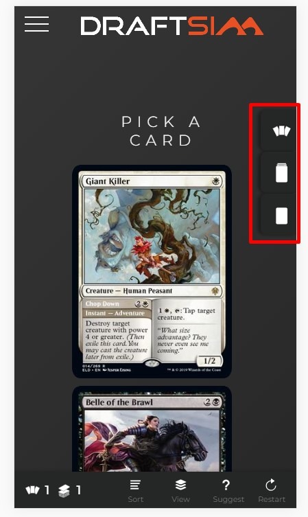
The sidebar is now gone! It's been replaced with three buttons on the right side that will allow you to toggle between the pack, your drafted cards (which go right to your deck), and your sideboard:
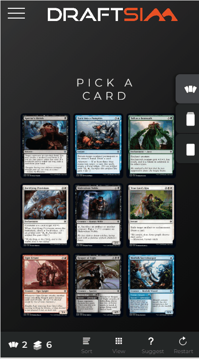
After you start making picks, cards will appear in your deck. Unlike the original version of Draftsim, you don't have to scroll up and down a bunch to see all the cards in different areas. And unlike with the slider, you're now able to see them all spread out:
The other major change to the drafting interface is the sort menu. This used to be part of the sidebar/slider area and was comprised of several buttons. Now, pressing one button will pop up a modal menu for you…

Hopefully this is a lot easier for you to select what you need and see all the options in one place.
There's a lot of flexibility there. I think the #1 reason that people wanted the old interface back was because they couldn't see all their drafted cards spread out like they could before. That has now been addressed, and I made it the default mode on mobile.
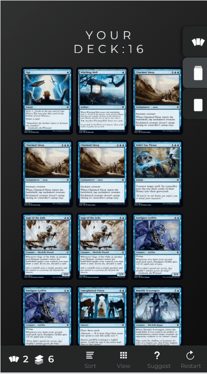
However, you can now seamlessly toggle back and forth between viewing your deck and sideboard in piles vs spread out:

And you can sort by color, converted mana cost (curve), rarity, or rating in both spread and piled mode:
And don't forget that you can always switch between big and small mode when in the spread sort to read your cards more easily:

No matter what your preferred view is during a draft, this should have all your bases covered!
Draft and Sealed Deckbuilding
A similar design was implemented for deckbuilding. There are tabs on the side that let you switch between your pool, your deck, and the stack of basic lands:
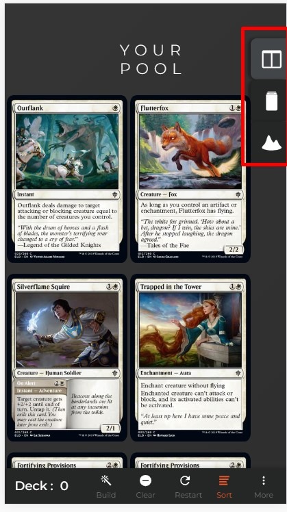
And as with drafting, you can view the cards in “spread” out mode or piled for grouping and analysis:
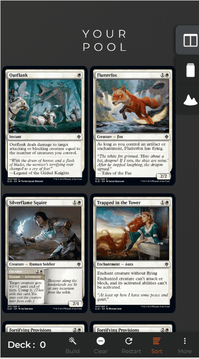
And you might notice in this version that the sort menu has changed – it's been made identical to the draft sort menu and works exactly the same way.
So that's it for what's changed!
Keep up the Feedback
I hope these changes made your life a little easier as a mobile user. Try it out for a while and then let me know what you think.
Feel free to drop a comment below this article whether you like or don't like the new look, or if you have further suggestions. Also, since this was a pretty major change, I want to make sure I didn't introduce any new bugs. So please let me know if you spot anything.
If you want to chat about the changes, you can always message me in our Discord channel or if you're the letter writing type, please send me a note via the contact form.
Thanks for your patience while I reworked this part of the site! Happy drafting, y'all.
Follow Draftsim for awesome articles and set updates:


2 Comments
Impressive! Nice work!!
The updates for mobile look really promising.
Many of these new mobile features could be used for the desktop version to great benefit, I feel.
Regarding deck-building on desktop, I find it a bit odd that your deck gets sorted in color first, and then casting cost, as the display of your curve is then fragmented into e.g. 3 parts.
Add Comment