Last updated on June 18, 2021
Nov 10, 2019: Another round of major updates for mobile devices has been pushed since this article was published. Read more about the changes here.
You may have noticed things look different around here. Well, a lot different!
I'm so excited to share all the changes to Draftsim with you. The user interface has been completely redesigned with a brand new feel for both draft and sealed. This is the result of a lot of hard work over the past few months. But I think the end result is a lot sexier, more fun, and more usable than before, so I really hope you enjoy it.
First of all, thank you so much to developer extraordinaire and volunteer Edgar Kisman for spending several nights and weekends working on this project. His vision was incredible and this whole project wouldn't have been possible at all without him.
And also thank you to the hundreds of you who helped test out the beta version and gave feedback while it was under development – I love you guys and your help was absolutely essential. I ended up making several changes and even rewriting a bunch of the functionality based on the suggestions you made.
Without further ado, let me walk you through all the changes…
Changes
The old interface was functional and simple, but hopefully this new one is a vast improvement. I wanted it to be equally as functional and snappy, but also easier to use and more aesthetically pleasing. We really tried to improve the drafting experience (I can't wait to tell you about a couple fun new features we added) and to make deckbuilding way better.
Heck, I'll admit it — I used to use Magic Online to build my pools from Draftsim. Now that's saying something…
Yes, the minimalism of the previous site was appealing in its own way, but the main thing I wanted to do here was make the site and its functionality better, regardless of aesthetics.
For now, the drafting engine underneath is still the same one from the previous version of the website. So no AI updates, this is just a complete reworking of the front end.
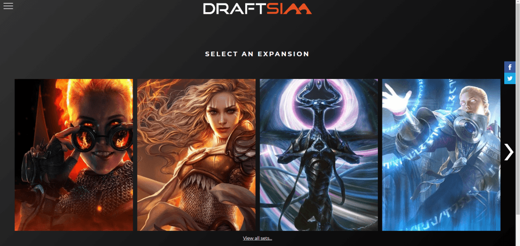
Home Screen
This is where the sexy starts, I really love the effects that Edgar added. Everything fades in nicely and feels really juicy. I imagine this is probably the first thing you noticed about the new design too.
Awww yeahhh look at that carousel with its hover effects…
If you want a full list of sets where you don't have to scroll through the carousel, there's a link below the images that you can click on, just like before. No worries, there's still an All Sets page.
The menu has moved too, to a hamburger menu. If you're looking for it, just click on the stacked lines in the upper left:
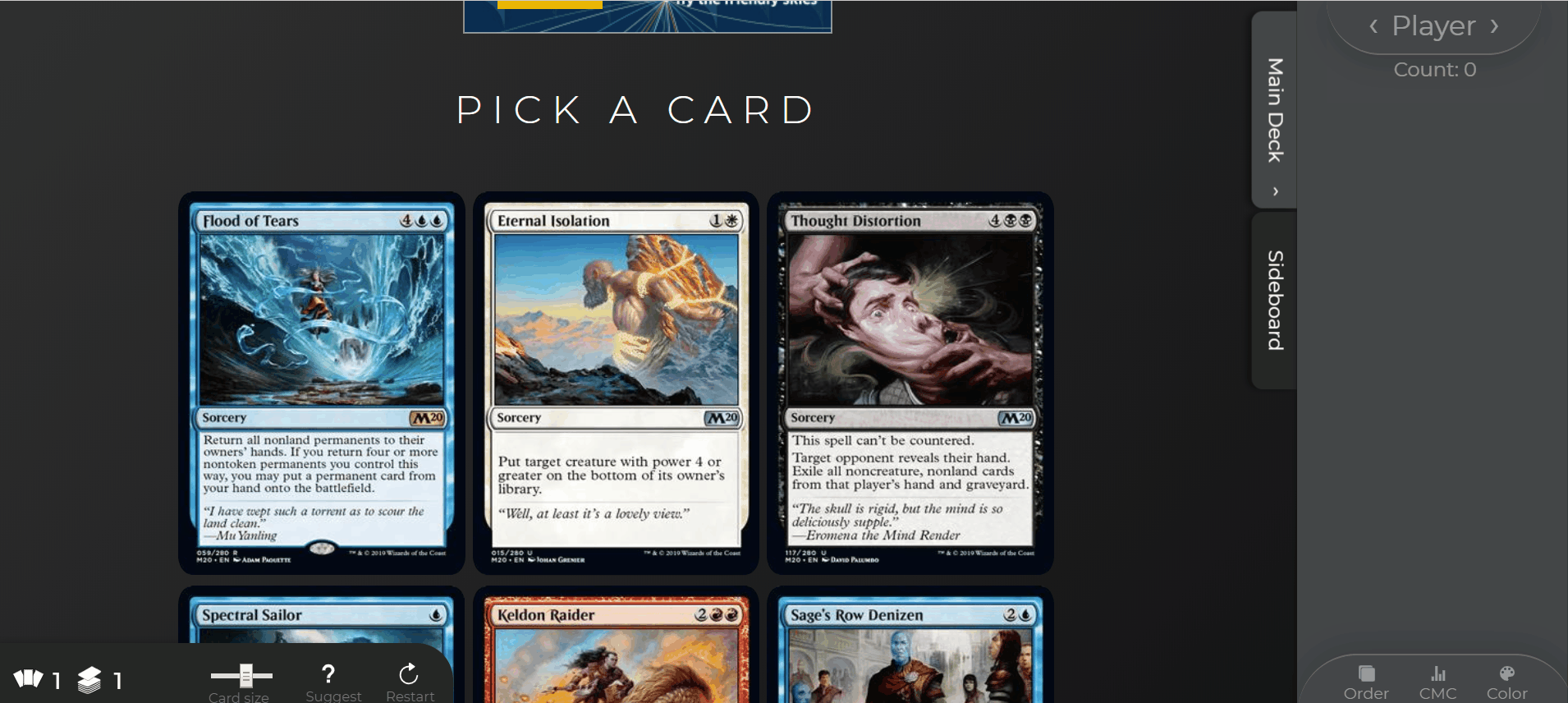
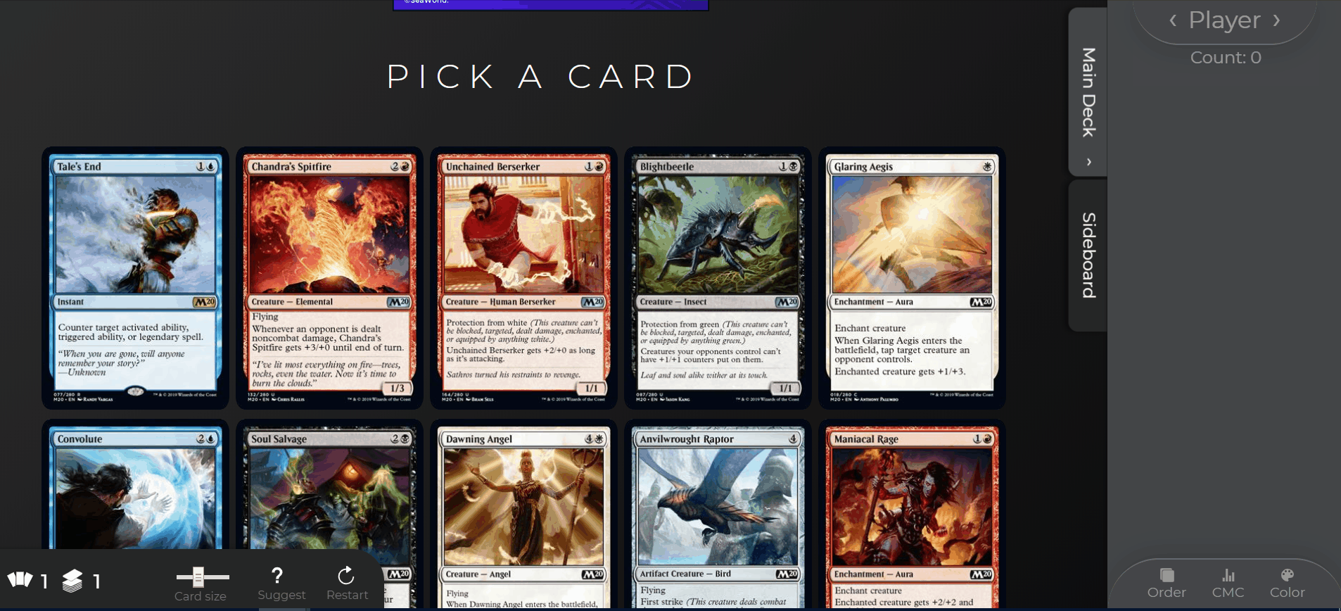
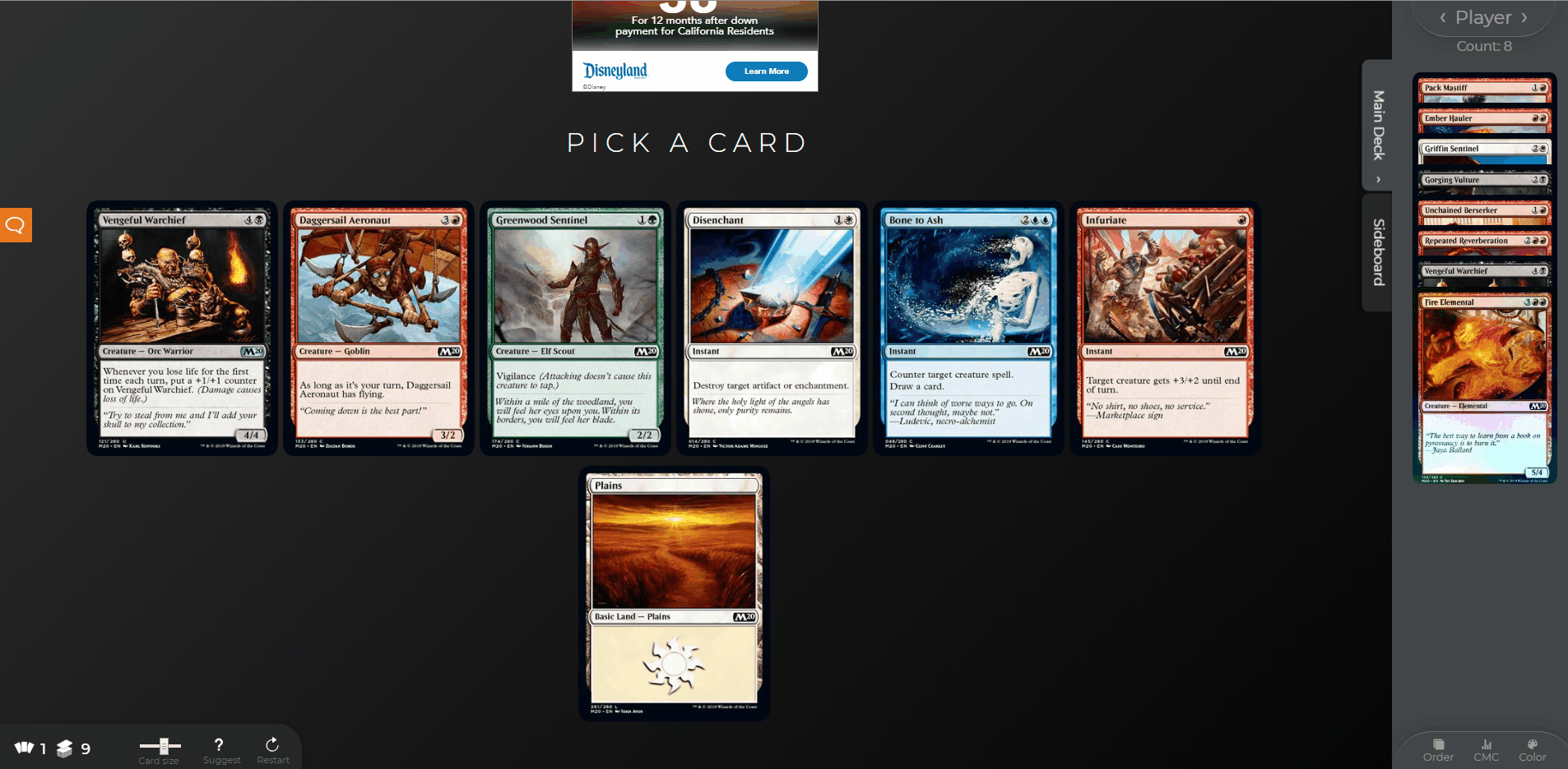
Draft Interface
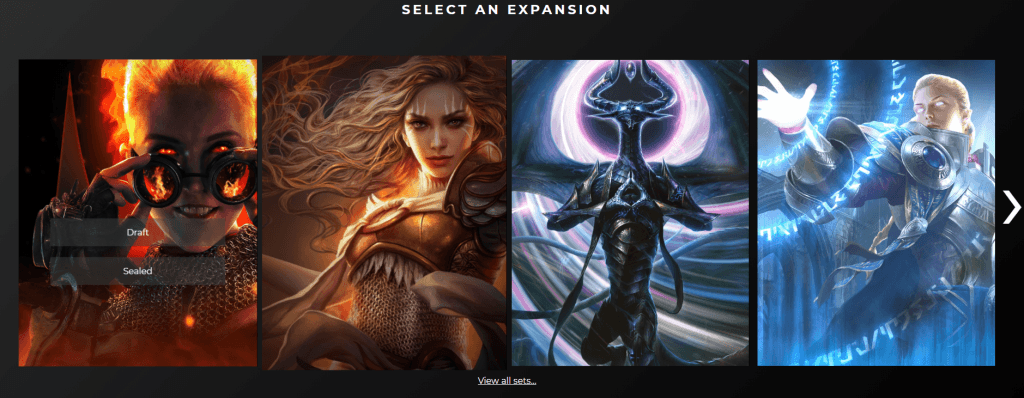
Ok, so let's choose our favorite set on the homepage and start drafting! What to look at first?
More slick effects
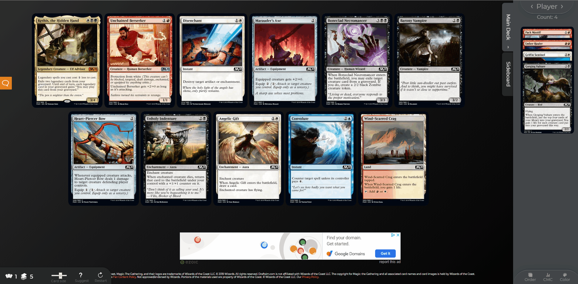
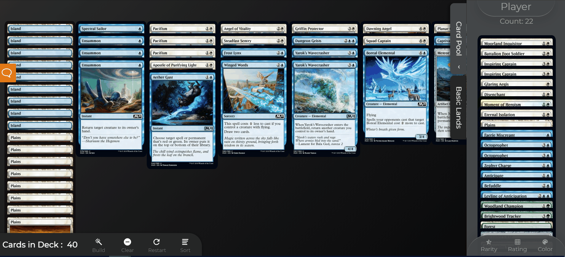
One of the main components of the new design is the sidebar. All the cards that you draft will go here. By clicking on the “picked cards” tab of the sidebar, you can also hide it (or show it again) to change the amount of real estate you have available on the screen.
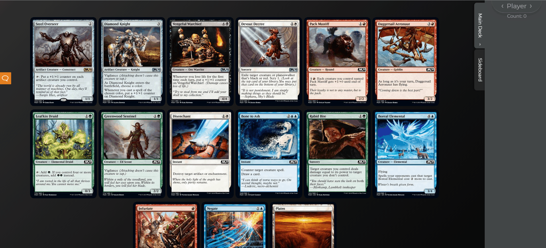
You'll also notice that when you hover over one of the cards in the sidebar, you see a tooltip/hover effect that shows you an enlarged version of the card so you can remind yourself what it does.
Dynamic resizing, finally
I don't know about you, but in the old version I was always using ctrl + mouse wheel to resize the packs to be the right size. Now we have a way to do this on the site directly!
In the desktop version, there is a slider on the bottom that lets you choose six different sizes for the cards. Pick the one that's most comfortable for your screen size, and the site will remember your choice the next time you draft.
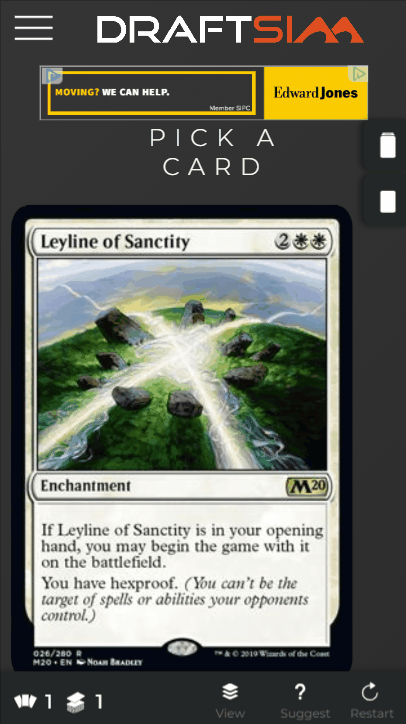
On mobile, there isn't a slider, but there is a view toggle. This gives you a “big mode” and a “small mode” depending on your familiarity with the set. You can use the big mode if you need to read the cards, and the small mode if you want to draft quickly and can recognize the cards by their art.
I'm definitely open to feedback on this feature, because I want to make sure the mobile experience for the new site is a lot better than the old one.
The Sidebar
As I mentioned before, the most dramatic change to the whole interface is the introduction of the sidebar. An issue with the last version of Draftsim is that you would have to constantly scroll up and down to see your picks/deck. Now the workflow is much easier.
I'm hoping this will drastically reduce the amount of scrolling you have to do during the draft. I think it's really nice to be able to see your pool of drafted cards side-by-side with the pack.
By default the sidebar is open, but you can also hide it if you need more space or are trying to memorize your picks.
Moving cards to your sideboard while drafting
Like the old version of Draftsim, you can still move your picks to your sideboard while you're drafting.
Just click (or tap) on the card while it's on the “Main Deck” tab and it will disappear. Click on the “Sideboard” tab to view all the cards that you've moved to your sideboard.
Both of these tabs have built in sorting functions that you can use to sort your cards by their color, the converted mana cost, or the order that you drafted them in.
Don't forget that because the cards in the sidebar are covered up, we also added a handy tooltip to help enlarge the cards for you when you mouseover.
Oh what's this… new feature!
Those little arrows next to the word “Player” (that's you) allow you to see the bot picks during the draft. That's right, you can now peek at the bots while you're drafting if you want to see what the other players at the table are doing next to you.
I think this can really help you understand the dynamics of the draft as a whole and to understand why you're seeing specific cards come back (or not come back to you) in a particular draft.
Hey, stop cheating!
Suggestions
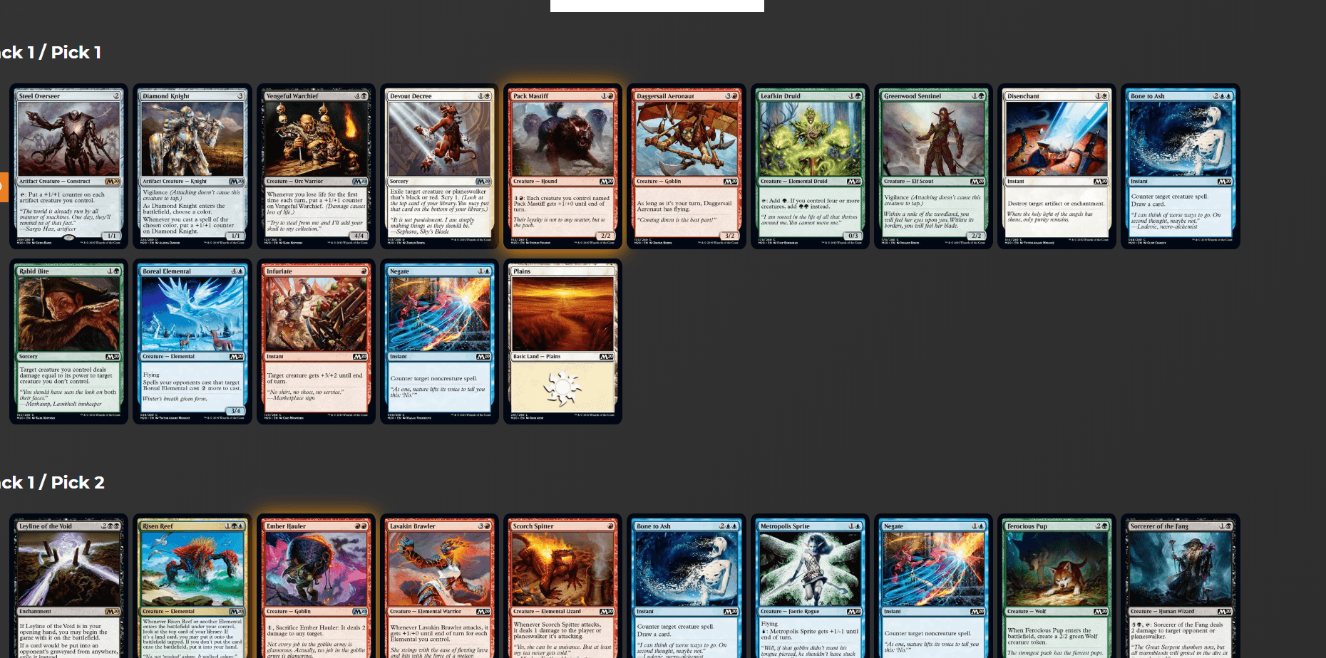
One feature that a lot of people love about Draftsim is the suggestions. They not only give you an inside look at how the bots are drafting, but you can use the suggestions to learn a new draft format and to get a feel for the relative power level of the cards.
Instead of having a table of suggestions at the bottom, the suggestions are now overlaid on top of the card. Again, this should help you cut down on scrolling quite a bit.
And there's a nice glowing aura over the “best pick”.
On mobile, the suggestions display differently depending on whether you're in “big mode” or “small mode”. Big mode will show the full breakdown with the color breakdown, while small mode only shows the overall suggested pick.
The In-Between
Want to keep drafting? Want to build the deck you just drafted? Want to share your draft log and get help? The choice is yours.
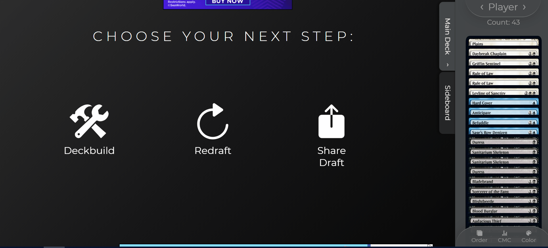
Hmm, what to do next…
If you click “Share Draft”, a dialog will pop up letting you know that the URL for the draft log has been copied to your clipboard. Navigating to that URL will display a pick-by-pick breakdown of your draft:
But for now, let's move on to building the deck we just drafted.
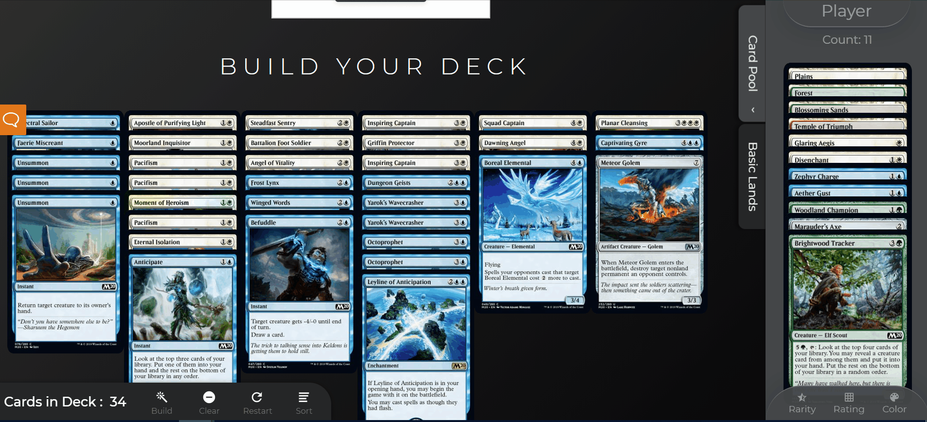
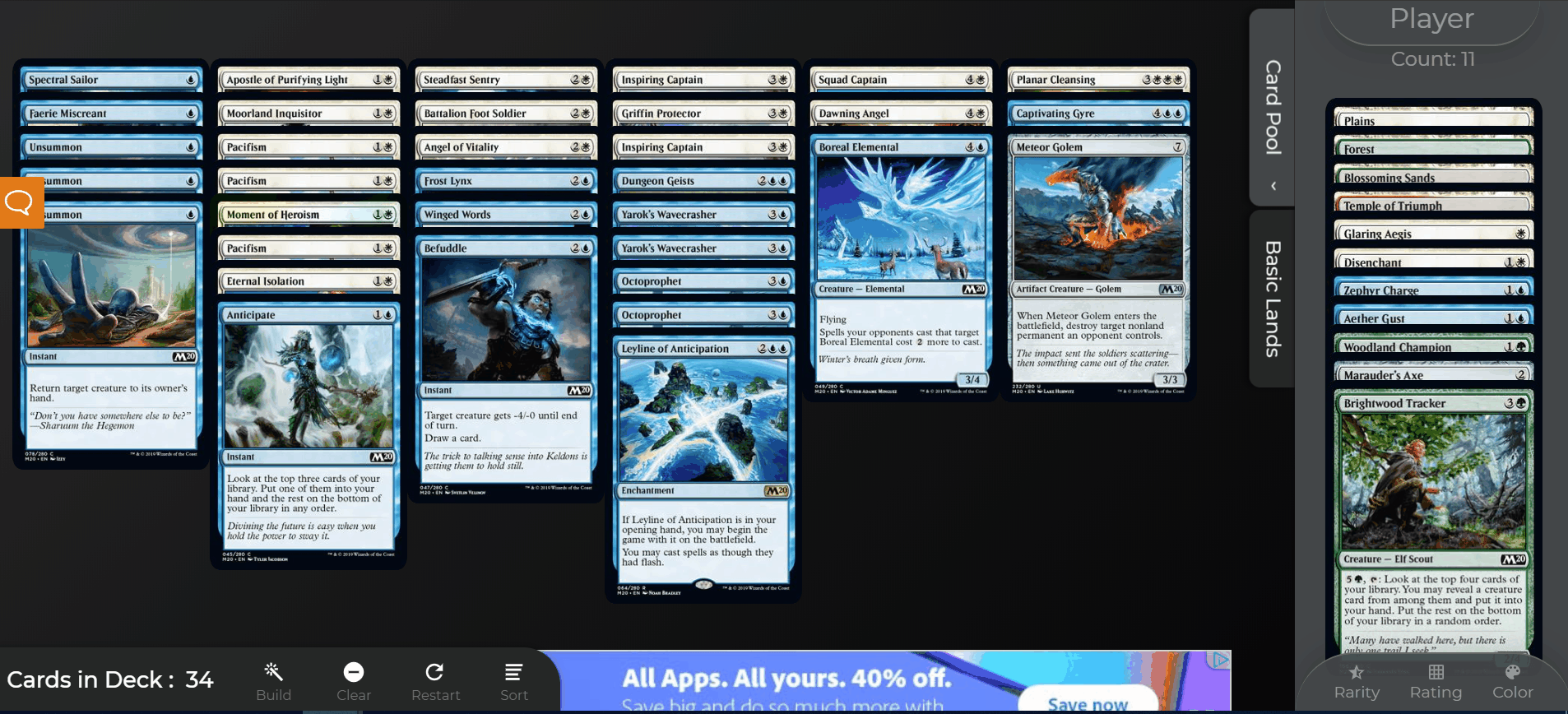
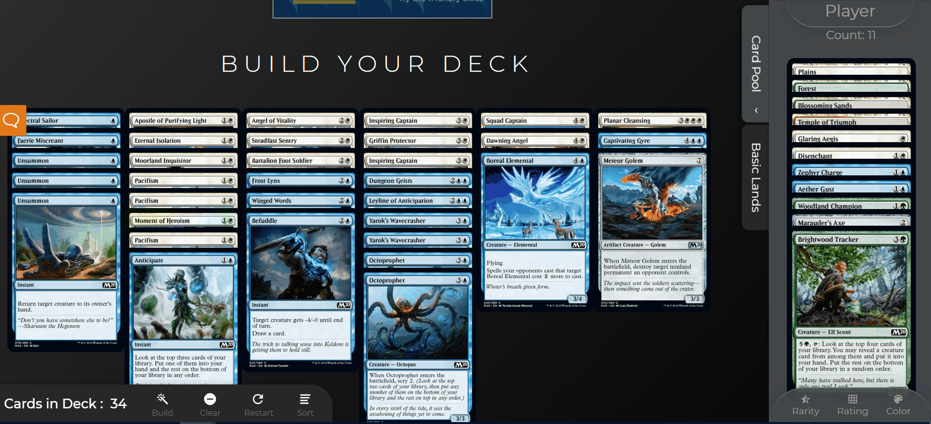
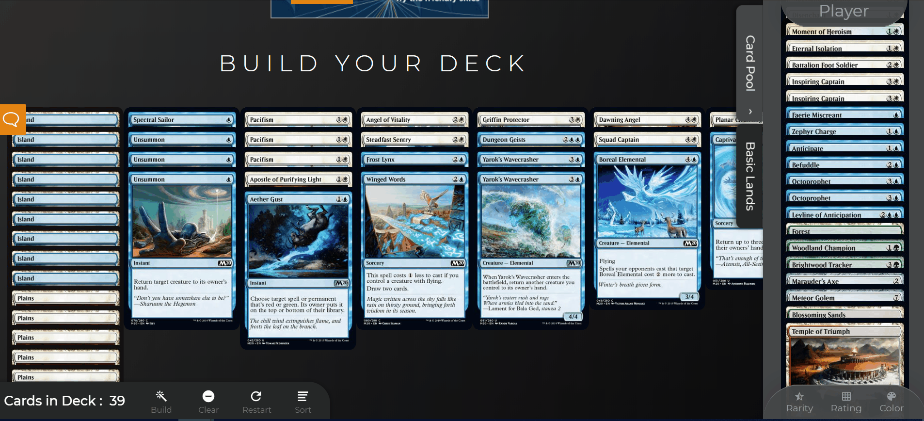
Deckbuilding Drastically Upgraded
Let's say you were moving some cards to your sideboard during the drafting process. So you have some cards in your main deck in one tab and your proposed sideboard over in another tab.
When deckbuilding begins, it will automatically start you where you left off during drafting. So if you had 34 cards in your main deck and 11 in your sideboard during the draft, your cards will start off split this way in the deckbuilding screen.
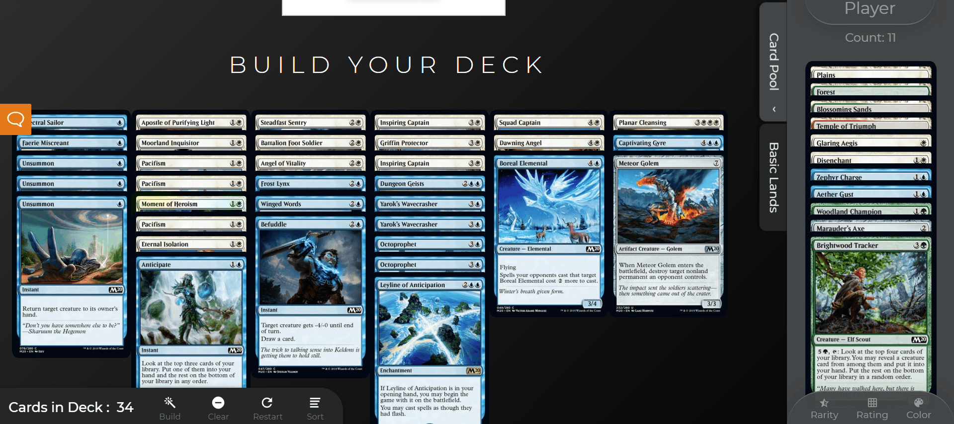
Now the cards are displayed in piles for mana curve, a common best practice for deckbuilding and a much easier way to display your deck. I think this is a big improvement over having them spread out and is closer to the way you would do this process “IRL”.
Don't worry, you can still see the full text and image of the card as you mouse over it.
So there are two spaces, a “main area” and a sidebar.
The larger area on the left is your workspace where you move cards in and out of your deck. All the cards in your sideboard are over in the sidebar. If you don't like this configuration, fear not, there's a way to change it.
The piles of cards automatically resize and change columns based on the number of CMCs (or rarities, or colors) of cards you have.
But if you'd rather have your deck over to the side, you're in luck!
Switch between “pool mode” and “deck mode” — and sort like a boss
When I was testing out this new look, I received a lot of (conflicting) feedback from people about what they liked better for deckbuilding. “I want to have my deck in only one pile, like Arena.” “It makes way more sense to have the deck laid out by CMC so I can visualize it.” Well then, why not have both?
Meet the lovely “Swap” button that lets you switch seamlessly back and forth between having your deck or your pool in the main workspace/content area of the screen.
Whichever configuration you use last will be saved by the site as your default for the next time you build a deck.
This main area can be sorted by converted mana cost (CMC), color, or rarity. I've anticipated that you might want to keep switching back and forth between these various sort option and even continue to swap the deck/pool views throughout the deckbuilding process.
And of course, Draftsim's awesome autobuild feature is still there, just click the magic wand and the AI will give you a great starting point for your deck. And you can just clear your deck if you want to start over or if you don't like Draftsim's suggestions.
Want to restart your draft without having to go all the way back to the homepage? Click the “Restart” button at any time.
The drafting part is more fun anyway…
Just like during drafting, you can shrink and expand the sidebar to give yourself more or less space.
And that's pretty much it for changes to the draft simulator part of the site. I'd love to hear what you think about all this!
By the Way, the Blog Was Also Upgraded
You may have noticed when reading this post that the blog area looks a little different. With the new “dark mode” version of the site, I wanted to re-theme the blog and reorganize it to look more connected to the remainder of the site.
Where did ___ go?
I know it always takes a while to get used to new interfaces. And it's hard to rewire your brain and get used to where everything is.
That said, if you have questions about how to do something in the new Draftsim or you have noticed bugs in the new UI (I'll admit, this is possible!), please let me know. Just leave a comment below or shoot me a note and I'll try to help you out ASAP.
Thank you, thank you, thank you for using Draftsim and for being such an amazing community. I truly hope you enjoy the new interface.
And again, all credit to Edgar. His design is great, bravo!
Even More Great Limited Content
In other Draftsim news, we've launched a new Twitter account called Limited Decklists to share winning (“trophy”) decks and the draft logs from the folks who are crushing the current formats. Make sure to give the new account a follow and to tweet @limiteddecks when you win a draft on Arena or MTGO so we can share your success!
And of course, be sure to follow Draftsim on Twitter and Facebook – I'm going to be rolling out more big updates that will be announced later this year.
Finally, if you love the new design, please consider helping the site out and donating to my Patreon campaign. All support is appreciated!
Until next time,
Dan


64 Comments
The new interface is great on desktop but it’s not great on mobile. I’m fact, it’s nearly unusable for deck building and very clunky for drafting. Is there any chance of keeping the old interface for mobile or shrinking the new elements down further for mobile?
Sure I definitely want to keep making changes ASAP to make the mobile experience better. Can you tell me which elements are too big or making it hard to use? And what device/browser you’re using?
biggest one I can see right off the bat is the mouse over doesnt work on mobile. making sorting cards impossible unless you already know the cards.
I’m going to hit this in the next update by allowing different sorting options within the “Spread” view mode. But for the time being you can use the spread sort to view the cards.
The new layout is terrible on mobile. I miss the old version, any way to still provide access to the old version?
Ben – can you give me some more details on what is too hard to do in mobile? I will get it fixed. Also let me know what browser/device you’re using.
Hi Dan, thanks for taking user feedback into account and your great work on Draftsim. I’ve enjoyed it thoroughly for a long time. On mobile, the old layout was just more accessible…I could go through a draft without ever switching views or toggling between screens…I could make my pick above, and then scroll down to see and sort my current picks. I could also zoom in and out as I wished to make the cards bigger or smaller (allowing me to either see all the cards in the pack at once, albeit a bit smaller, or focus in on cards when sets were new and I wasn’t familiar with them). I don’t think I’m doing a great job explaining, sorry. The new layout just makes it harder to look at everything at once, deckbuild, etc. when you’re dealing with a small vertically oriented screen. It’s nice on a big PC screen, but honestly there was nothing wrong with the old layout that I can think of, it was perfect for mobile and desktop. I’m on iOS (Safari). Thanks again.
I’m hoping at least as far as drafting goes that it is at least equivalent. Opening and closing the sidebar should be equivalent to scrolling down, and you can make the cards bigger with the view button.
Deckbuilding I’m definitely sympathetic to some suggestions on improving for mobile if anyone has them.
Hi Dan,
Thanks again for taking feedback into account. I’ll try to do a better job explaining, and address deckbuilding specifically. I’m not one to complain just to complain because I don’t like change; I honestly can’t use and enjoy the new draftsim on my iPhone, whereas I would previously visit draftsim 10-25 times per day whenever I had a few minutes to kill.
OTTOWA did a better job explaining one aspect of it than me, below. Humans are visual, so both in looking at the picks I have thus far during the draft, and particularly during deckbuilding, on a small mobile screen not being able to see the full card and the art is a major issue. It means I’m constantly zooming way in just to read the card name, whereas with the old version I could do a complete draft and build my deck without ever doing anything more than scrolling up and down.
Making picks is still fine, you kept that layout and I’m grateful for that. But trying to switch between making a pick and seeing what picks I already have is much more difficult on mobile now. Scrolling down was much easier compared with trying to click a small icon (and some of us have larger fingers than others) to open a sidebar/window, and then close it again. I have hit the wrong place multiple times and opened an ad or made a pick I didn’t mean to make. Then when I have that sidebar open to see my current picks, again, I can’t see the art so it’s harder to get an idea of what’s happening at a glance, and trying to sort them is much more difficult.
Most importantly, and this is the real killer that is making it almost unusable for me, is the ability to select individual cards to move between main deck and sideboard, in both deckbuilding and during the draft in the “picks thus far” sidebar/window.” When I click a card, first it gets bigger and covers up other cards below it, and then most of the time it gets selected. I constantly accidentally add cards to my deck I didn’t mean to, and then screw up again and take cards I want in my deck out when I go in to remove the unwanted card. This new interface on mobile requires much more finger dexterity and clicking in precise, small locations. You can’t just draft quick and easy when you’re waiting for your to-go order at a restaurant or similar. You have to focus, and be super careful with your clicks and scrolling. The older interface was much more user friendly.
Finally, in deckbuilding, in addition to the above-mentioned problems with trying to select individual cards (and having them automatically blow up and cover other cards, but then go in the deck whether you want them to or not), on mobile you have a narrow vertical area with your pool, and then a narrow vertical area for your deck. To try to scroll to see all the cards (generally those with higher CMC) in the pool window, it’s often very difficult to get the pool area to move, and I have to keep struggling to drag the screen to the side to get to my higher CMC picks and try to add them to my deck.
Anyway, I hope this helps explain things. Again, I appreciate all your work with this, I hate to be a downer. But honestly, all the other draft simulators already had problems similar to the ones I’m describing. Draftsim was the one simple, user-friendly, mobile-friendly platform that I could use on the go, and I loved it. I’m sad to see it change so drastically. My #1 suggestion would be to switch deckbuilding back to the old format, where you can see your cards (art and all) and click on them individually, with your deck below (rather than in a different window). Of course, if the same could be done for picks made thus far during a draft, I’d be thrilled.
Thanks again,
Ben
absolutely, totally agree with Ben (his next big message in this thread – cannot reply to it).
PLEASE keep the possibility to switch to the old mode – it was so comfortable using it on mobile, whereas with the new design it becomes very, very hard (due to the reasons explained by Ben).
Hope you understand, and thank you for the project!
I just changed the mobile deckbuilding to no longer use the sidebar, which I think improves the experience a lot. Do you find it better? I’m also planning to do the same thing to the drafting – bring it back to tabs that you switch between instead of having a sidebar.
Deckbuilding is still unusable on mobile – tab with cards shows just a list, and if you dont know all the cards by their name you cannot build the deck.
on the first days of the new design it showed the card preview by long-click (now it is not working btw – android, opera), but this anyway took toooo long to be used often.
actually previously I used to spent loads of time on the draftsim – especially when the new set was upcomming, or just when having 15 spare minutes.
now I hardly could force myself to try to draft several times prior to ELD prerelease, but just skipped the deckbuilding part – cause its a nightmare now.
please, please – return the possibility to switch to the old design if the user wants to. mobile users will say a big THANK YOU!
Did you try the “spread” sort option? This does exactly what you’re talking about…
What happened to the deck list it would generate? I’ve tried to find it and can’t find it anywhere without losing my drafts. please add the deck list back.
Thanks! Will re-add this functionality back in soon.
Thank you so much, I’m trying to teach my son how to draft and I could easily copy the draft list and put it into a deck building program and it would build the deck and we could run it against one i had built to test our builds, was so quick and easy that way.
I’m having some layout issues similar to Ben’s. It’s very hard for me to see the picks I’ve already made with the new layout – All the cards are small and are overlapping each other. Even on a PC it’s difficult to get a good overview.
I prefer the old style, where your card pool was the same size as the cards in packs, and the pool was layed out on rows without overlapping cards.
I would like to add to my previous comment:
The human brain processes and recalls images faster than text, which is why it takes many times longer to process the card names of cards in your card pool stacked on top of each other compared to being able to look at the card art.
Gotcha, thanks.
+1000! agree!
First, just wanted to say new layout is amazing. I’ve noticed an issue on mobile where the bar with an options (restart, view etc) that should be at the bottom is either gone or hidden behind ads. Switch to desktop site and is showing again.
Thanks, I just disabled the ads at the bottom of the screen, let me know if this doesn’t fix it.
On mobile, I don’t see the bar at the bottom that lets you switch between big and small mode. I feel like small mode might be useable, but big node you can only see 1 card at a time so it’s not a great drafting experience if you know the set. And since I can’t switch to small mode it’s basic unuauoj mobile right now.
Thanks! I suspect this is because it was covered by ads – try clearing your browser cache/history and trying again and let me know if that fixed it.
I found your site 2 days ago. Thank you for doing this.. The new version looks good to me.
Thank you, glad you’re enjoying it.
Hello,
I discovered the site only a few weeks back, and I was really impressed by it and I use it daily since. Several time a day, actually, just because (well, can’t really afford to draft for real several time a day, see).
Now this new layout is just plainly AWESOME. It is simply beautiful and elegant, there is nothing not to like about it.
As for features, I really enjoy having the suggestions overlaying the cards, instead of listed below (makes us watch and ponder instead of being lazy and pick the highest rated suggestion).
Same for the deck building interface: lovely.
Very very good job and congratulations.
Keep at it and thank you VERY much
Wow thank you, this warms my heart!
Hey there, I’ve been using Draftsim for months now both for drafts with friends and just spending hours upon hours practice drafting both before going to prereleases and just during my spare time. I’m always on mobile though and cool looking as the new layout is it’s basically impossible to use on mobile, the entire site is clunky and slow, the rotating spiral of sets is similarly tricky to navigate, but most of all when it comes to drafting, I can only see one card at a time, or three per row when they’re all small – which doesn’t let me see an entire pack at once.
One of the major reasons I used it so much was how elegantly simple it was, and how easy it was to quickly draft and save a deck list for later. Other people have mentioned having the old format back and honestly, as cool looking as the new format is on desktop, I’d really appreciate being able to choose between the old and the new.
Thank you so much for keeping this place functioning though, I don’t know of any other sites like it.
Thanks – you mentioned only being able to see three per row in “small” mode — this should enable you to see the entire pack at once in several rows. Or you can’t see the whole pack because the sidebar is expanded? Feel free to shoot me a screenshot [email protected]
I just reduced the amount of transition time for opening the sidebar so it should be much easier to open/close it to “check” what you have. I’m also going to change the nav menu on the homepage to have a text list of sets easily accessible.
Hi Dan, I’ve been enjoying Draftsim for several years now. I mainly use it on an ipad. The new layout doesn’t work. AFAIK, there is no way to actually look at at and read a card. Am I supposed to dig down until it is the only card left in the mana curve? The old layout was much more functional. Please let us choose the old layout on mobile. Pretty is not better. Functional is better.
Thanks for letting me know, definitely thinking about this. In the meantime, are you able to tap and hold down on a card to bring it to the foreground? This works on my own mobile device (not an iPad) at least.
Hi Dan, tap and hold isn’t working for me (ipad air 2). I get feedback that a selection is made, but no foreground image of the card. Same behavior in both “main area” and side bar. Another issue, and a complete show stopper… the main area is not scrollable, so cards in the 5 or greater CC mana slot just disappear when you add land. When I tried the new Draft Sim on my Mac, totally different. It’s a smooth and polished experience (mouse over makes all the difference). Just not working so well on mobile devices. What percentage of your traffic is mobile? I really don’t want to use desktop outside of working hours. Cheers and thanks for the excellent website.
David – try clearing your browser cache and then let me know if the updated version of the site is working any better. I can scroll up and down the main content area using an iPhone but need confirmation that it works on an iPad.
I am able to tap a card to bring it to the foreground, but the area to tap on mobile is tiny, so I often tap the wrong card. More importantly, it covers the surrounding cards and goes in either the deck or SB (so if I just want to look at a card, it often accidentally ends up in my deck anyway).
I’ll just make one last comment and leave it at this: As someone said above, the old Draftsim’s elegant simplicity was its greatest strength. I liked the old one so much, and find the new one so unusable, that I would very gladly pay a substantial fee for access to the old site. It’s night and day. Thanks again.
Just pushed a change to do the following things for deckbuilding:
* Cards in main area for mobile are now significantly bigger
* Cards and piles of cards are now vertically scrollable instead of horizontal
* Added a sort mode in mobile called “Spread” that displays cards individually
You probably will have to clear your browser cache to see all these changes take effect.
Is there a way to switch back to the old version. I really don’t like this one. I was a really big fan of the site/service previously. Can you maybe had a way to switch to the clean/efficient old version for people like me?
Ignacio – can you let me know what kind of device you’re on and the specifics of what you don’t like about it?
Hey Dan. Love Drafsim but i must echo the difficulty of use on mobile device. I have been unable to see more than 2 cards side-by-side due to the extra width of the side pannels. This is not a huge problem but it is nearly impossible to build a deck. The cards are displayed as stacked too tightly and my Homer Simpson fingers are too big to select a card reliabily.
Thanks James – I have recently made changes to make the cards in the sideboard stack more uniformly in the sidebar and to have the cards in the main area much bigger + have an option to spread them out via sorting. Let me know if this helps address the issue at all.
The changes helped a little bit, thank you for making them, but I would still gladly pay a hefty monthly fee to be able to use the old version. This new layout is still just miles behind the great site I knew and loved. As some have said, is there a way you could let users choose which version to use? Thanks again, it’s a free product and I appreciate all your hard work. But it’s a real bummer to lose the elegantly simple, user friendly platform—the best and only thing of its kind online. I really miss it.
I understand this, but there’s no way I can continue to maintain two separate versions of the site. I would much rather make the new site better — this way it’s good for people who aren’t trying to find a hidden old version too.
Thanks Dan. I’m sorry to keep going on and on, I just want to offer whatever feedback I can to make Draftsim fun to use again. I truly loved it. Two specific suggestions: First, when the new version first came out, during the drafting portion, I was at least able to see the whole pack on one screen (cards laid out three per row). Since the updates, it went down to two per row (requiring scrolling), and today when I tried to use it, I can only see one per row (and the option to change the view from one per row to two/three per row has disappeared). In the initial iteration of the new version, you had the draft part right for mobile…it was just seeing picks thus far and deckbuilding that were major problems. Now the drafting part is hard to use and enjoy, as well. Second, I appreciate you adding the spread layout for deckbuilding. That does help somewhat. But the fundamental problem with both deckbuilding and picks thus far is that, with the cards stacked on top of each other, at least on iPhone (Safari), the feature to click and hold the card to zoom in also selects the card. I can’t click and zoom in on a card, but then not switch it between main deck and sideboard or vice-versa. If I click a card in any way, it will move between maindeck and sideboard. This leads to an incredibly frustrating chain of accidentally moving cards to the wrong place, then moving them back but accidentally moving other cards, etc. I rarely finish deckbuilding, because it’s just too frustrating. And I don’t even have particularly big fingers. The beauty of the old version was being able to draft and build a deck with one hand and finger (thumb) and nothing more than scrolling, and then marvel at the deck and think, “Wow, I would love to play this through a tournament.” (I also echo others’ pleas to bring back the decklist feature). All in all, I just don’t see this as an upgrade at all. Others may disagree, and I respect their opinions, but there is something to the “if it ain’t broke, don’t fix it” saying. Draftsim was fantastic. Now it looks a bit more modern, but is much less fun and accessible on mobile (and even on desktop, it’s arguably worse than the old version). Sorry for all the ranting and comments. The reason I’m so vocal is a positive one: I loved the product you built. I commend you for it, and thank you for the many months I got to enjoy it. I just don’t have the time to get out and draft in person much, and in addition to getting my draft fix, Draftsim was a great distraction on my phone anytime I had a few minutes to wait, etc. I’m hoping that you are able to tweak this new version so that it retains the elegant simplicity of the old version (or just return to the old version and add features without totally overhauling the basic functionality like this). Anyway, as always, thanks. I know it’s a free product, I don’t like to gripe, I’m just downright sad about all this and I miss Draftsim. Thank you for your efforts.
Lovely – heaps more usable.Big thanks. How do you get to the ‘Choose your next step’ part, please?
This part appears automatically after you finish a draft. Once you make the last pick this screen comes up.
Hey Dan! Similar feelings to everyone else about the new interface on mobile, it’s really not great, but on desktop it’s very easy to draft. My main concern and source of major frustration is that there’s no deck list once you’ve made a 40 card deck like the old version. I have no way to copy the card names to my clip board and then paste them into Cockatrice or just save the decklist. I really don’t want to have to go back to manually inputting 40 cards every draft…
I am working on re-implementing this, hopefully it should be back relatively soon.
Hi Dan!
I see it’s back, thank you very much!
As for mobile, picking cards is a little tedious since you can only see one card at a time so you have to scroll up and down to see the entire pack (though as you make picks that becomes easier obviously), and why scrolling it’s possible to pick the wrong card accidentally. Deckbuilding is very tricky though since you can’t have both the deck and the pool on screen at once, and when you try and hover over a card to see what it does it immediately selects it and moves it to the other tab. Also, you can’t see the entire deck/the curve of your deck at once since the cards stack up by CMC and only two columns fit side by side. It’s manageable and now that I can save my drafts again it’s much better, but still somewhat tricky compared to old Draftsim. On desktop though it’s absolutely great – only issue is that I can’t find how to see all the cards at once without zooming out, but that’s much more of a minor issue on desktop, I wouldn’t worry about that too much.
Thanks again for what you do dude!
Ah heck, I take it back, can’t get it to paste on my phone since I don’t think it has a clipboard? I used to just select the decklist and copy/paste it into notes for later, not sure why it won’t copy over now.
What kind of device do you have? The copy/paste is working on my phone.
OK thanks I’ll work on some of this. Can you clarify the bit about the CMC though? If all the cards are big enough to see, they wouldn’t fit horizontally without needing to scroll. Or you would prefer to scroll horizontally instead of vertically?
Also as specific as you can get on feedback with mobile I’d be interested to hear.
Hi Dan, I love the redesign and the site–it’s helped me a lot. Any chance you could add a “sample hand” feature? Just random hands of 7 from the pool. I’m trying to get better at splashing a third colour and it would help to sample several hands to get a feel for the balance of lands.
Cool, thanks! I am starting to get more requests for this so I will work it into the plans.
Thanks!
I don’t have the task bar/sidebar along the bottom when drafting that enables card scaling or showing rankings. Is this an error?
I accidentally pushed an update that broke this on Friday but it should be back to working now.
Hello, I use draftsim for sealed and there is no slider to change the card size like in draft. Please help myopic people like me to be happy by including this feature for sealed too. Thank you!
Is there a way to get an ultra-minimalistic layout for barebones use? It was really neat that it loaded at all on IE11 before, and I was a little startled when I was greeted with a dark grey background. The main page does not load properly with the phrase “Select an Expansion” just sitting there menacingly between the ads. A glimmer of hope returns with the View All Sets button and following page seeming to work, but actually trying to generate a pool doesn’t get anywhere, it seems. The two tabs on the right are a dull grey and are uninteractable, the toolbar in the bottom-right displays 1, 1, a scrollbar with no function, and the buttons view, suggest, and restart seem to do nothing to the blank background.
On the other hand, IE11 is beyond legacy at this point so I’d more than understand no interest in restoring it.
Is there still an option to turn on rare-drafting? I want to practice the authentic LGS experience.
I need to re-enable this. As it was before, the raredrafting was only available for sets with tons of chase rares like Masters sets.
Hi, same question of Andrew: is it possible to use draftsim with IE11? I can’t see the images that I should be able to click on!
I’m having the same issue with internet explorer, non of the card images load. (can’t download another browser because I like to practice drafting at work)
I had not used draftsim in a while, the mobile version of the new website is still sorely lacking when compared to the old version.
Add Comment