Last updated on February 20, 2026

Swamp | Illustration by Gaboleps
If you’ve been following previews for Teenage Mutant Ninja Turtles (TMT), you’ve probably noticed two things: Wizards is really leaning into the crossover…
… and a huge slice of Magic's playerbase is really not into the art direction.
The set releases next week, so we’re still in peak “first impressions” season. But the loudest impression on Reddit right now is: this set looks ugly.
Even TMNT Lovers Dislike TMT Art
Everything Pizza | Illustration by James Bousema
With the TMNT previews in full swing, several Reddit threads, some with thousands of upvotes, are decrying the art direction this set has taken.
“I grew up with TMT, absolutely adore it,” says u/TheIncredibleHelck in one of the most upvoted replies. “Didn't want it in my magic cards though… still a skip set for me.”
“I love TMNT, I enjoy magic,” agrees u/Professional-Web8436, “I hate everything about TMNT in Magic.”
Part of the problem some players have with the set is one that the artists could do nothing about: New York, as a setting, is a turn off for players. Magic is about planeswalkers jumping across planes; New York makes it feel like “planes” are the stuff tourists take at airports.
“Both this set and Spider Man are set in New York City,” notes u/ShockinglyAccurate. “I play Magic to be transported to creative worlds beyond my imagination, not to be transported a few states over.”
Of course, there's nothing that the art direction or the artists can do about an IP's location once the higher-ups have said “We're doing this.”
But, past that point, many players feel that the art direction is all over the place.
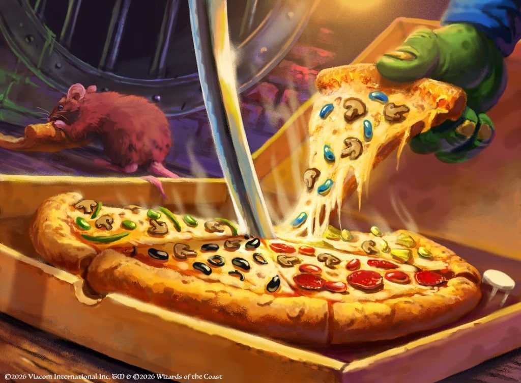
And a place in which there is way, way too much pizza.
Pizza, Pizza All the Way Down
Fun fact: TMNT is not the first Magic card with pizza on it. In fact, not even the first MTG card with a pizza and a turtle on it!

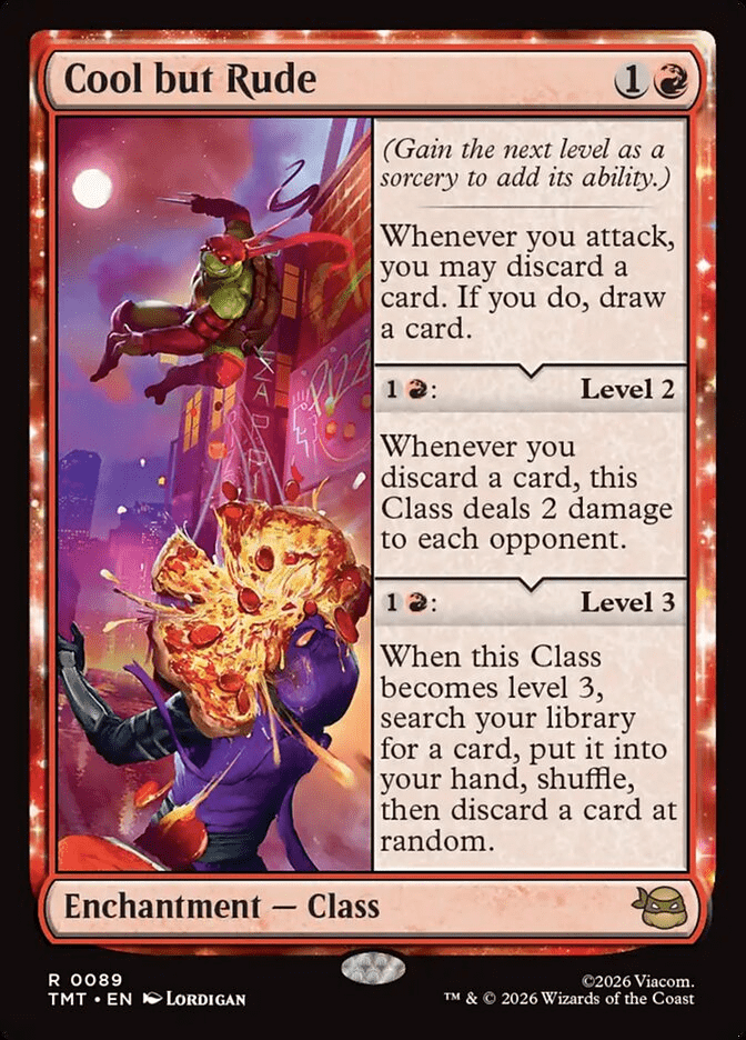
To be fair, Wizards is intentionally pushing pizza as a core aesthetic in this release. Right down to a product literally called the Pizza Bundle, with the infamous pizza-themed basic lands being part of the marketing hook. And, while it's true that some cards in the main set are focused on the pizza, like Cool but Rude…
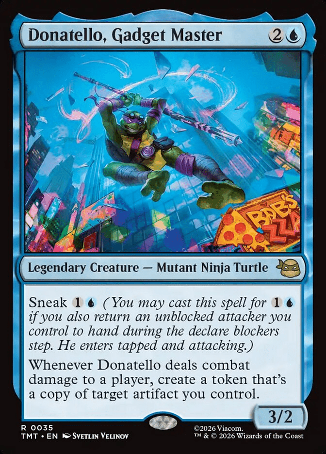
… in others the pizza is just part of the background, like Donatello, Gadget Master…
… and the huge majority of the TMT cards don't have a pizza anywhere on them.
Still, the cards that do feature pizza are so over the top, that players are even joking that TMT is pizza tribal.
“Isn't this franchise about anything else?” laments u/StFuzzySlippers
“Am I crazy or are these arts just essentially pizza gore?” wonders u/Right-Mycologist-321.
One of the cards that seems to clearly have jumped over the shark is the pizza'd version of Commander's Plate:
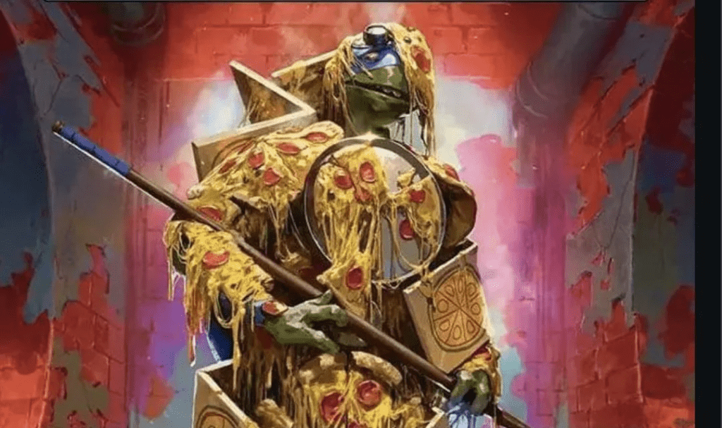
Source: Reddit
A thread with more than 1.6K upvotes has Magic players decrying this new version of the Commander staple, and several other threads have sprung with the same complaint: Cheese is not armor.
“The art is not bad,” argues u/Kellsiertern, “but it doesn't work with the intended feel of the card. The card is meant to be a power boost, but the art makes it feel like a prank victim, the art looks like a debuff card, something like Dead Weight or Mire's Grasp, not like a set of armor you would willingly wear.”
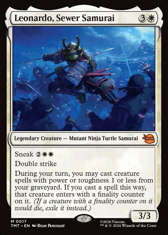
“Couldn't have used Shredder's iconic armor for the artwork?” wonders u/MagnusBrickson. And it's not like the TMNT franchise doesn't include armor. Heck, there are even TMT cards with armored turtles!
“They literally could have just had one of the turtles at a pizza place being given a plate of pizza. Nice pun, ha ha we get it,” notes u/TheBluOni.
But, nope; molten mozzarella seems to be the new steel plate.
Too Cheesy
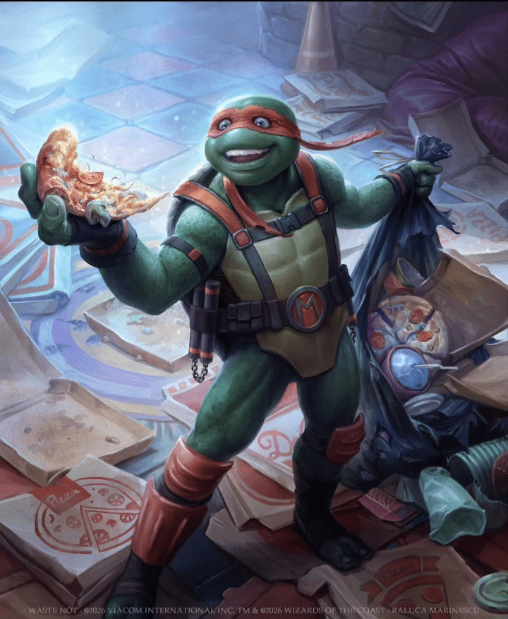
Waste Not (Teenage Mutant Ninja Turtles Eternal Legal) – art by Raluca Marinescu
Magic card art isn’t just decoration. Good game design requires a good artistic direction. Magic's Head Designer Mark Rosewater talks about this all the time: a card's art should match what you feel when you cast the spell.
When the visuals look off-putting , incoherent , or mismatched to the card identity (armor that looks more like Halloween costume than proper defense), players feel like the set is failing at the job Magic art usually does extremely well: making cardboard feel like a world.
Follow Draftsim for awesome articles and set updates:


Add Comment