Last updated on October 6, 2023
Hi! I’m Dan, and I run Draftsim, a website that helps people practice by drafting in a simulated environment against seven “bots” programmed with artificial intelligence. Along with some key collaborators, I’ve been working on a big project this year that I’m excited to finally share with you.
Have you ever wondered what a draft format looks like in one picture? Or what makes a format really “synergy dependent”? You’re in luck!
This past year we’ve been collecting anonymous data from the thousands of drafts that occur each day on Draftsim. It’s finally time to take a look at what we can learn from all that sweet, sweet data.
I owe all the credit for this project to Arseny Khakhalin (thank you Reddit for helping us connect!) and Bobby Mills from Bard College in New York. They helped me collect all the data on the site, do the analysis, and create these awesome visualizations.
Methodology
How much data are we talking about? Well, a lot.
Here’s how many human drafts we analyzed for each format:
- M19 Part I – 108,000 drafts (July 2018)
- M19 Part II – 48,000 drafts (August 2018)
- DOM – 51,000 drafts (April 2018)
- RIX (including XLN) – 10,000 drafts (February 2018)
In all, that’s actually over 200,000 drafts!
We simply captured the format being drafted, the cards presented to the user in the pack, and the card the user picked given his or her current card pool.
We recorded thousands upon thousands of anonymous user picks
For each draft, we looked at the final pile of cards a user ended up with, and dutifully marked which cards were drafted together in a table that reflected all possible “card pairs.” After going through thousands of drafts, we compared these co-occurrences of cards in final draft pools to numbers that you could expect to get by chance, as if all drafts were completely random. Obviously, some pairs of cards were drafted together way more often than you’d expect by random chance, while some cards were drafted together less often.
At this point we used a standard statistical technique called multidimensional scaling to visualize the allegiances of different cards in a nice plot. To do so, we imagined that each card is represented by a point, and distances between these points depend on how often they are drafted together. Cards with a synergy were assigned small distances between them, while cards that are only drafted together by chance were assigned large distances.
We then utilized a function in the statistical computing language R called cmdscale (the whole analysis was performed in R), and asked it to find an arrangement of points in a 2D or 3D space that would achieve these predefined pairwise distances as well as it possibly could. The function finds an arrangement of points, and then we visualize it either with ggplot (for 2D plots) or with rgl package (for 3D) to get the pictures you’ll see below.
Results and Analysis
So enough with the talk about how we got there—let’s see what we found out! We’ll start with the recent M19 data, mostly from August.
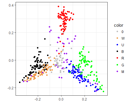
Visualizing M19
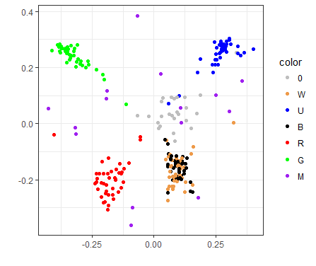
A 2D visualization of the M19 draft format
On this plot, each point represents a card. Red cards are red, green ones are green, and so on, except that the white cards are gold colored. Colorless and artifact cards are gray. All multicolored cards, regardless of guild, are shown in purple for simplicity’s sake.
If two cards are often drafted together, they are shown close to each other on this plot. If the cards are almost never drafted together, they will be very far from each other on the plot.
Note also that the X and Y axes are not really interpretable; they're just a way to plot the points, but there is no deep meaning to them.
If you’re wondering which card each dot represents, a similar picture that has each point labeled can be found here.
As you can see, it is not easy to represent a complex drafting landscape in a 2D image, so a card may be in the center both if it is drafted with any color (like most artifact cards), and also if it is drafted in decks of two opposing colors (like Gruul or Izzet on this plot). But at least you can spot things that are suspicious and investigate them.
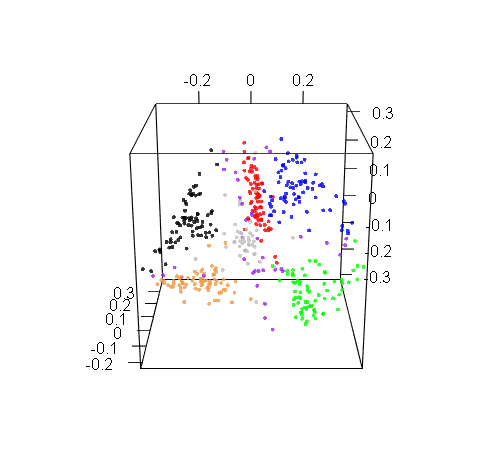
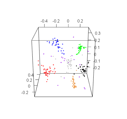
Plotting in 3D might be more informative, but the trouble with 3D plots is that you still need to show them on 2D screens, which really limits their utility. Here’s a 3D projection of M19 drafts: pretty, but hard to use.
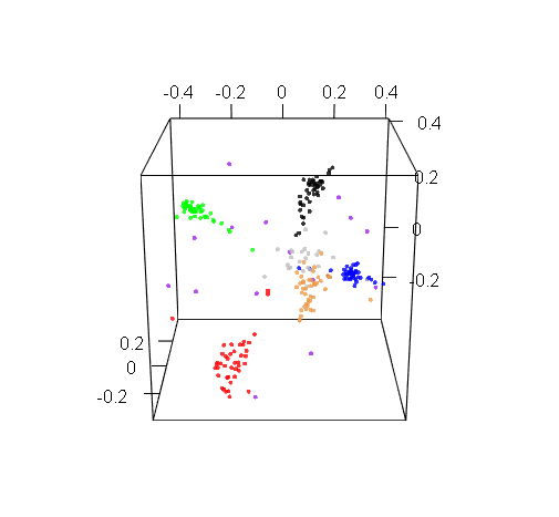
M19 live and in 3D
Observations
The first thing we can see here is that cards of the same color are drafted together, which seems obvious. But even then, exceptions prove the rule, and we have quite a few interesting exceptions.
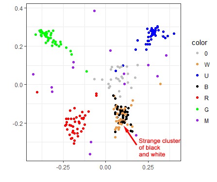
For one, the black and white cards don’t form distinct clusters, which hints that in M19 drafts, players tend to pair W with B more often than with any other color, and vice versa.
The reality is a bit more complicated: white and black cards actually do form distinct clusters, but these clusters are closer to each other than any other two color clusters. So when the multidimensional scaling tried to show all cards on a 2D picture, and looked for some complexity to sacrifice, it sort of folded them together. But if you look at the 3D graph earlier, you’ll see that the white and black clusters are actually distinct. This is an artifact of the 2D visualization method, but it is an artifact that appeared for a reason.
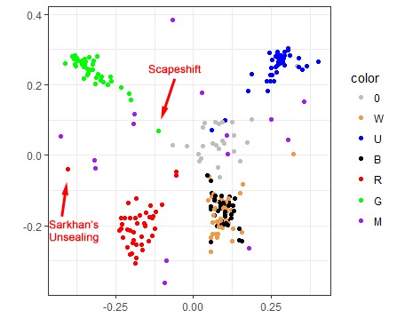
We can also hunt for individual points that don’t belong to the cloud. See that red dot on the very left, far from the main red cluster? That’s Sarkhan's Unsealing, a card that benefits from large, beefy creatures, and even though it is strictly red, players treated it as a Gruul (RG) card. Or look at that green card that is closer to artifact cards than to other green ones: that’s Scapeshift, which is completely unplayable. However, some Draftsim users like to raredraft, so it was drafted as if it were color agnostic.
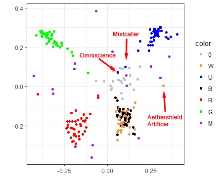
And while we’re on the subject of unplayables, you’ll also find Omniscience and Mistcaller sitting in the middle since they wouldn’t reasonably be included in any M19 draft deck either.
What about that lonely white card on the far right? That's Aethershield Artificer, which pumps artifact creatures, making it an obvious synergy payoff for the blue/white Artifacts Matter deck.
Enough about relationships, what about power?
We can also mine draft results for other, more straightforward types of information. For example, which cards are the absolute winners that are always picked first? Here’s the top five list:
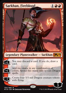
- Sarkhan, Fireblood
- Palladia-Mors, the Ruiner
- Cleansing Nova
- Sarkhan's Unsealing
- Lathliss, Dragon Queen
This is interesting. While these are mostly great pack-one-pick-ones, they’re certainly not what I have rated as the top five cards in the set. Sarkhan especially is strange, but people love Planeswalkers and the card is deceptively worse than it looks.
And what cards don’t see any love from drafters? Here are the bottom five, most frequently picked last (so shown backwards, from worst to slightly less worse):
Apparently, “tower” cards are bad.
No comment…
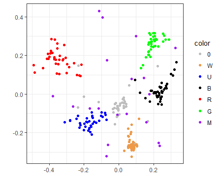
RIX/XLN visualization
Do all draft formats have similar shapes? Not at all, and of course the Ixalan and Rivals of Ixalan formats are special here, because their synergies are based largely not only on color pairs, but also on tribes that are in those colors. So the plot ends up looking completely different:
Click here for version with cards labeled
Here we have Vampires on the left (with Anointed Deacon and multicolored Legion Lieutenant leading the charge), Merfolk on the right, and the red guys on the top—Pirates and Dinosaurs alike. What is the half-ring of multicolored cards surrounding the red cloud? Pirates are on the left (leaning towards the black Pirates), and Dinosaurs on the right (towards green, and to a lesser extent, white creatures).
Look how closely WB Vampires and UG Merfolk are clustered. These are the two tribes in the set that were represented by only two colors, so they end up grouped very closely together.
Contrast that with Grixis Pirates (B/R/U) and to Naya Dinosaurs (G/W/R). The relationships are much more spread apart and less tightly correlated than the two-color tribes.
Red is in a special place because the color “belongs” to neither Vampires nor Merfolk. When you pick a red card, assuming an equal archetype distribution, it has an equal chance of ending up in a tribal deck of any of the four colors — either a Pirate deck (RB or UR) or a Dinosaur deck (GR or RW). In contrast, it’s not so with black, where you can end up in Pirates (RB or UB) or Vampires (WB) only, if you stick to the prescribed tribal archetypes and groupings of synergy.
In XLN/RIX, GB and UW were “tribeless”, making their synergies—if they existed at all—much less pronounced. It makes sense that we don’t see them bumping up against each other here.
DOM visualization
Click here for version with cards labeled
Dominaria seems to have the most separation between colors of all three. Perhaps this has to do with the high individual power level of many of the cards in the set. Moreover, in DOM, artifacts do not form an amorphous cloud in the center, but make a cluster of their own, very close to U/W/B, which happen to be the colors that care much more about historic triggers.
Not too surprisingly, the blue cards that pull closer to red are Wizards synergy cards (e.g., Naban, Dean of Iteration, Vodalian Arcanist, and Wizard's Retort), and the ones that are closer to white are either artifact/historic payoffs or enablers (e.g., The Antiquities War, Artificer's Assistant, Zahid, Djinn of the Lamp, Karn's Temporal Sundering, Sentinel of the Pearl Trident).
I’m not sure how to explain why white is so closely clustered together versus red, however. This possibly indicates a replacability/lack of synergy among white’s cards or perhaps a tendency of the white cards to only be drafted with each other.
Bonus: Just for fun, here are the other two 3D visualizations that we generated for RIX and DOM:
RIX 3D visualization
DOM 3D visualization
Where To Go From Here? Some Exciting Future Possibilities…
So this is all really cool, but what can we do with it?
Training Draftsim’s AI to use this data and capture synergy
Synergy in Magic is a very difficult thing to measure because it shifts from format to format. In one block, R&D may introduce a new mechanic that explicitly drives synergy (such as historic, kicker, or cycling), but another might primarily use tribes, such as in Ixalan. And let’s not even get started with cards that are “better for aggro decks” or “control” decks. After all, most decks in limited are just some flavor of midrange, right?
Rather than individually scoring or programming all these factors for each set, it would make a lot of sense to enlist Draftsim’s wonderful user base to help train the algorithm to recognize synergistic pairings of cards.
We could then in turn train the AI to make more realistic decisions based on the clusters of cards that are frequently drafted together.
Encapsulate the shifting “draft metagame”
It would be fascinating to track how cards and color pairs become progressively more or less overvalued during the course of the format. You might see certain color pairs move around as archetypes go in and out of vogue or one color gets recognized as “bad”. And, like in constructed, a draft metagame seems like it would eventually settle somewhere.
And wouldn’t it be really fun to be able to quantitatively measure what cards people “slept on” at the beginning of a format? Or to assign archetypes and see how our understanding of what cards belong in them changes? You could then use this information to improve your card and archetype evaluation methods.
In fact, this leads into our next article where we’ll do a quantitative analysis of how much a format changes over the course of a month. Here’s a little taste of what we’ll be looking at:
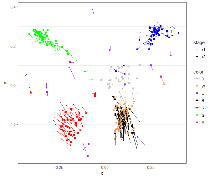
M19: A draft format in motion
That's right—we have before and after data that we can use to measure changes. Double the data means double the fun!
Stay tuned to find out…
Clustering decks instead of cards
This whole article we've been looking at defining a format by the relationships between individual cards. However, we can also zoom out and examine the end product of your draft as well: your final collection of drafted cards.
By looking at the features of these collections, we can use unsupervised learning algorithms to group decks into archetypes. This will give us a clear picture of the kinds of decks that you will likely face in a draft metagame, the key cards in those decks, and frequency of those decks being drafted.
Not only would this help all of us learn a ton about drafting, we could start exploring draft bot “personalities”. Maybe one bot at your table is leaning towards drafting something aggressive, while another bot just can’t wait to Cancel every bomb you draft. These personalities could very well mimic the same drafting preferences you see from people at your local game store.
Final Thoughts
One thing that really surprised me was the shapes of the formats—even in the more meaningful 3D visualizations. RIX looks incredibly different than the more “normal” M19 and Dominaria formats. Perhaps by looking at these shapes and patterns, we can quickly figure out some important or valuable points about approaching a format. As we get more data from different sets, more patterns should emerge.
This is such a treasure trove of data that I’m sure there are many ways we could use this methodology to learn more about Magic and about its different draft formats. Let us know what other awesome things you think we could do or what else you’d like to see measured and analyzed!
If you enjoyed the read, be sure to follow Draftsim on Twitter or Facebook for more. And why not give the draft simulator a try?
Follow Draftsim for awesome articles and set updates:


18 Comments
This is fantastic, cool to know that draftsim is evolving!
Would love some more simpler features through: like building a deck from a bot’s deck for testing and plenty more
Thanks, noted!
Wonderful data !
The different patterns fascinate me since I’ve recently found out that different sound can make a pattern which is very similar in shape .
The ancients knew this and science has rediscovered it . A church in England has carved shapes which now is found to be a piece of music. It tickles me to imagine each set having its own unique musical tone
Going forward I can see this information becoming a great testing tool for the designers at wizards to check the set is how they intended it to be and perhaps a cool new way of designing sets altogether !
Definitely post to data is beautiful
Luke
Yes! Dominaria a beautiful symphony, Ixalan… well. Thanks – it looks like somebody did submit it to r/dataisbeautiful hope we’ll get some good feedback from the folks there too.
Interesting analysis! Love the idea of capturing synergy in different formats to train bots. For visualization I would recommend using bokeh, a Python library for creating interactive plots. Here is an example plot I made for my research: https://kbsezginel.github.io/irmof1dmog/.
As you can see when you hover each data point you can see more info and even an image if you like. I think bokeh can even support 3D scatter plots as well. Let me know if you are interested and I can provide any help.
Cool, thanks for the tip. Yes I think we’ll try to make some interactive visualizations in the next article.
Wow, really interesting! Any chance you could make the 3d dataset public? I would LOVE to build an interactive visualization where you can explore a draft format in 3d and click on individual cards etc. Please? 🙂
We’re currently discussing how/what/when to make all the data available. But we’re also thanking about making our own enhanced and interactive visualizations too. Be sure to check back for the follow up article.
Interesting stuff!
With the quantity of data you have available I wonder if you’d could analyse how colour choices form, and which colours people weight towards at the start of a draft – maybe by looking at the distances between the cards picked through P1P1-7? I’m expecting that as you add a higher number of picks into the data pool and illustrate the distances the plot will evolve gradually into the final plots that you have shown above. The rate at which it crystallises into this may represent how quickly people shift from staying open to aiming for a particular build? Card preference/weighting may be hard to visualise simultaneously though.
I also wonder if hate drafting shows up in the data? Maybe this could be determined by looking for how often a card picked relatively highly pack 1, or highly picked pack 1-2 with ultimately high synergy in the pool is also picked relatively highly pack 3 into pools with low synergy?
Interesting points. Right now the bots have logic where they hard commit to two colors in pack 2. But it would be cool to see how/when people do the same.
Hate drafting might be a little more difficult to tell. I know from experience that the extent to which you hate draft really depends on the type of environment you’re in. For example at a GP, I might be willing to P3P1 an unbeatable rare if there isn’t something crucial for my deck because I could end up playing against/losing to that card. On a Magic Online league, however, you have very little incentive to hate draft because you probably won’t play against people in your pod. In a draft simulator, it matters even less because you don’t play out the games! So I would guess people hardly prioritize hate drafting at all, but I’ll bet they do some, especially if they’re thinking “this shouldn’t be in here, I can’t believe the bots didn’t take it…”
Hey, is it possible to add foils to the draft? Sometimes it makes you pick between two rares and it is brings interesting decisions.
This is true, and is a great suggestion. I’ll look into doing this.
Not a high priority from a drafting perspective, but from a data perspective it’s likely to reflect reality better if you include print runs.
I’m very much looking forward to the next article.
I would like to see a 3d plot that uses the data of the 2d plot for the x and y dimensions, but uses the prioritization data for the 3rd dimension. If scaled properly, this gives the property of distance between points a sense of balance between power and synergy that I believe could be informative for a budding AI. Visually, you could take the data and one particular deck could be shown by connecting the dots representing cards in the deck, and it would likely look something like a Christmas tree. For each format, teach the AIs how certain types of decks “look” and allow them to choose cards to approximate that look. AIs are actually great at this sort of stuff, sorting and imitating textures and shapes. Heck, you wouldn’t even need to limit yourself to three dimensions. You could stick mana cost along a 4th dimension and do the same thing, which would probably make a big difference to draft quality.
This type of analysis is close to my heart, so I hope to see some good progress. It’s super interesting stuff.
Most of the links for cards that have apostrophes in them are broken.
For example, the first mention of Sarkhan’s Unsealing has a working link: https://deckbox.org/mtg/Sarkhan's%20Unsealing
However when it’s listed in the top 5 drafted the link is broken since the apostrophe is being encoded: https://deckbox.org/mtg/Sarkhan%E2%80%99s%20Unsealing
This seems to be true for all of the other links to cards that have apostrophes.
Awesome article, BTW 🙂
Fixed, thanks!
Hi, I really like these efforts to dissect a draft format. Very good stuff!
I was curious in the details on how you compute the “distance” of two cards in order to apply the mulitdimensional scaling. You say it’s something like ‘observed’ versus ‘expected’ cooccurences within the final pool. Here I’m interested in how you actually determined the expected cooccurences.
I’would assume that pure random picking would generate expected co-occurences, but this would also leave individual power level unaccounted for? I’m not sure if this would be a desirable effect.
On a similar note, did you utilize the order in which the cards were picked or did you perform the analyses solely based on the final card pools?
I would be glad to gain some more insight in your computations. Keep up the good work.
Hi, I really like these efforts to dissect a draft format. Very good stuff!
I was curious in the details on how you compute the “distance” of two cards in order to apply the mulitdimensional scaling. You say it’s something like ‘observed’ versus ‘expected’ cooccurences within the final pool. Here I’m interested in how you actually determined the expected co-occurrences.
I would assume that pure random picking would generate expected co-occurrences, but this would also leave individual power level unaccounted for? I would guess that random co-occurrences of stronger cards are less frequent than those of weaker cards, although I’m not sure? But if so, did you account for that in any way?
On a similar note, when analyzing the data did you utilize the order in which the cards were picked or did you perform the analyzes solely based on the final card pools?
I would be glad to gain some more insight in your computations. Keep up the good work.
Hi Felix,
thanks for your kind words!
> I was curious in the details on how you compute the “distance” of two cards in order to apply the mulitdimensional scaling. You say it’s something like ‘observed’ versus ‘expected’ cooccurences within the final pool. Here I’m interested in how you actually determined the expected co-occurrences.
I just looked at every final hand, and calculated p(i) of each card being there. Then if they are drafted randomly, p(ij) would be = p(i)p(j). But actually some were over, some were under-represented. So I just calculated it as a = p(ij)/[p(i)p(j)] . Now a is big if cards are drafted together, small (zero?) if not.
To go to distances, I just did d = 1-a/max(a) , or rather d=1-0.99*a/max(a), as I didn’t want to have d=0 for any given pair. And then on this matrix I ran MDS.
> I would assume that pure random picking would generate expected co-occurrences, but this would also leave individual power level unaccounted for?
The power is sitting somewhere inside this data, of course, but in a hidden way. Say, two awesome rares of diff colors will be rarely drafted together, as by the time you see the 2nd one you already love the 1st one, and hesitant to switch. While “Naturalize” and “Smelt” will be frequently drafted together, just because nobody wants them. And this is totally reflected in the plot, which I think is kind of neat.
> I would guess that random co-occurrences of stronger cards are less frequent than those of weaker cards, although I’m not sure? But if so, did you account for that in any way?
I don’t quite know how, but also I’m not quite sure I want to, in this case. But if you have other ideas, let please me know!
> On a similar note, when analyzing the data did you utilize the order in which the cards were picked or did you perform the analyzes solely based on the final card pools?
Not for MDS, but all ranking comes from the pick order.
I’m actually thinking about posting all R code on my web site, just for funz. Unfortunately goodle sites don’t seem to be code-aware, so it turns out gray, which is a bummer; I hoped to see some nice colorful parentheses =)
Add Comment